WV4 Line 2 – Workshop 4: Analysis of results
-
Intro
-
Parallel coordinates plot analysis
-
Pareto front analysis
Information
| Primary software used | Grasshopper |
| Course | WV4 Line 2 – Workshop 4: Analysis of results |
| Primary subject | AI & ML |
| Secondary subject | Optimization |
| Level | Advanced |
| Last updated | November 27, 2024 |
| Keywords |
Responsible
| Teachers | |
| Faculty |
WV4 Line 2 – Workshop 4: Analysis of results 0/2
WV4 Line 2 – Workshop 4: Analysis of results
Terminology of parallel coordinate plot and pareto front for research purposes.
This workshop provides you with the basic concepts and terminology you use in Workshop 4. The workshop 4 explains analysis methods on how the generated data from simulation and optimization methods can be interpreted for research purposes. The first section explains how the parallel coordination plot can be used to draw conclusions from simulation data. The second section of the workshop explains how to select results from optimization data and how to use the pareto front.
WV4 Line 2 – Workshop 4: Analysis of results 1/2
Parallel coordinates plot analysislink copied
The parallel coordinates plot is a way to visualize high-dimensional data and analyse multivariate data. In comparison to scatterplots, the parallel coordinate plot is not limited by the number of dimensions to visualize. The data analysis method visualizes data points as a line through parallel axes. The parallel coordinates plot is a useful tool which allows for exploring correlations, clusters, outliers, trends, and variations. Relationships can be found in the plot by changing one variable and understanding how this corresponds with changes in other variables. Disadvantages of the plot are that an overload of data can result in obscured relationships as data lines overlap.
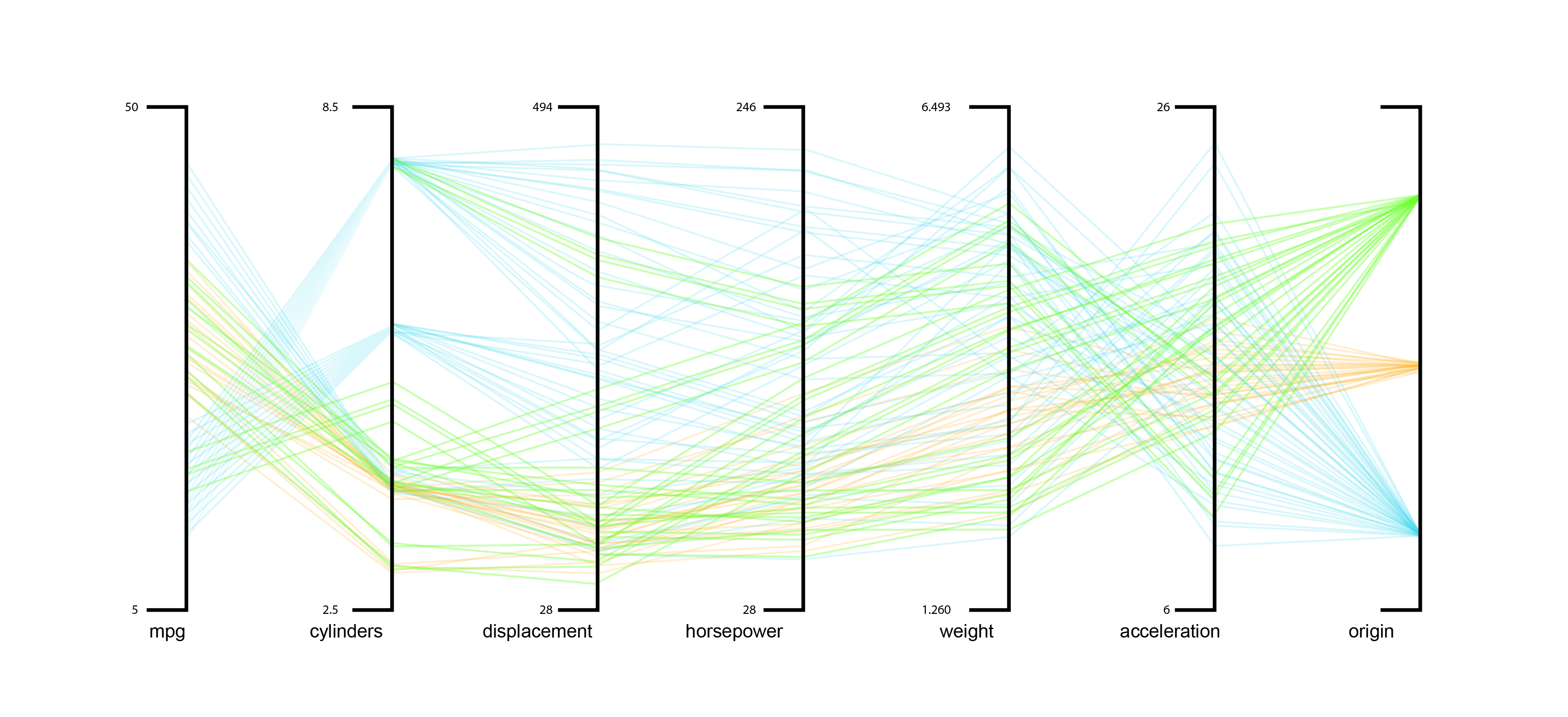
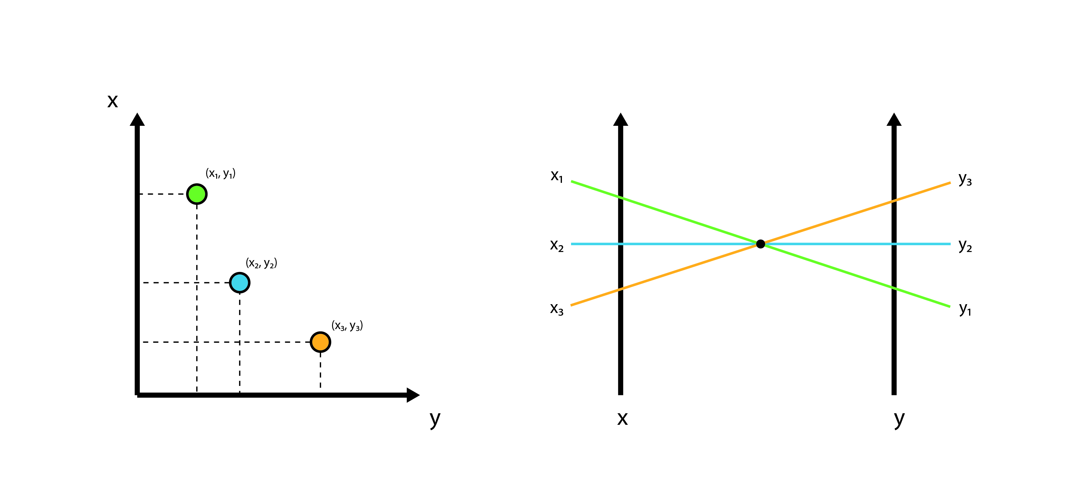
The datapoints are represented as lines that intersect different axes at the position that correspond with their respective characteristic. To create a parallel coordinate plot the data must be normalized to avoid discrepancies, since all the data is placed on a common scale.
Aside from using the parallel coordination plot for multidimensional data exploration and visualization, comparing design alternatives, and communication, the parallel coordination plot can also be used for feature analysis, outlier detection, and cluster identification. The arrangement of the features is very important as poorly arranged dimensions could result in visual clutter. Therefore, it is advisable to place the most similar dimensions next to each other
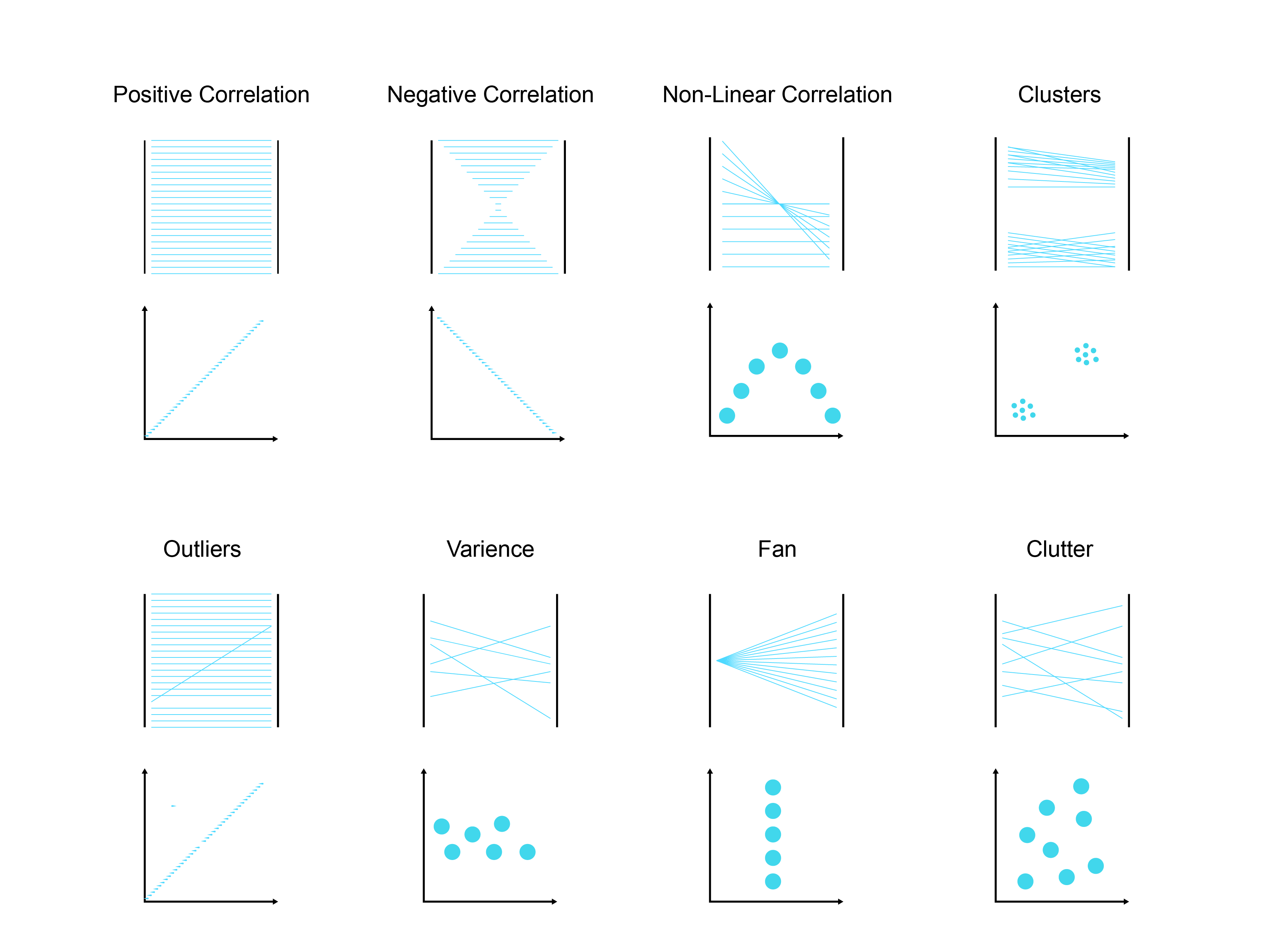
Correlations can be detected by analysing the lines in the graph. Parallel lines between axes indicate a positive correlation between variables, while intersecting lines indicate a negative correlation between variables. A line represents an outlier when the line deviates from most other lines in the parallel coordinates plot. Clusters appear as groups of parallel lines, which are similar datapoints that have similar patterns, and can be grouped together.
Visually you can spot different patterns in the parallel coordinates plot. However, in most cases the correlation will be smeared-out, leading to less striking visual patterns. For example, figure below shows a strong negative correlation while figure XX shows a more smeared out region of a moderate correlated relation.
Filtering to Select a Final Solution
After you have generated a parallel coordinate plot you can use different techniques to filter and analyse the data. You can filter the results by using a technique called brushing. Brushing highlights results with a specific range of values per parameter or per objective or for a combination of both. This creates a subset of the data based on the selected criteria. By selecting a range on individual axes, you isolate solutions that meet the desire performance thresholds. This process is useful in multi-objective optimization because it enables decision-makers to visually explore trade-offs between conflicting objectives. For example, if optimizing for cost, number of unique panels, and window-to-wall ratio, brushing can help identify solutions that balance all three by visually highlighting only those that meet specific thresholds on each axis. This filtered subset can then be further analysed to find a manageable set of optimal or near-optimal solutions, facilitating informed decision-making in complex optimization tasks. Alternatively, it can be used to change the priorities of different objectives. For example, maybe a mid-range price is worth a significant benefit in window to wall ratio. It is important to remember that there is no one single “optimal” solution in multi-objective optimization. There will always be a trade-off between different objectives.
Example A: Parallel chart simulation results selection
Follow this tutorial to learn how to use the parallel coordinate plot to analyse the data. You will get a better understanding on how to use Design Explorer to analyse the data with a parallel coordinate plot by using optimization results. You will learn how to apply brushing to understand how certain inputs impact the outcome
Example papers
The following papers give a clear explanation on how the discussed terminology can be used during research. We highly recommend you to look at these papers.
“Impact of Different Shading Devices on Daylight Performance and Visual Comfort of A Four Opening Sides’ Reading Room In Rasht” by Dabaj et al.
- ResearchGate Article by Dabaj et al. 2022
- Flow chart of research set-up
- Clear overview of used parameters and variables
- Clear description of simulation set-up
- Use baseline model to test model
- Uses parallel coordinates plot to investigate the results with a clear description of what the filtered results mean.
Debate A: Parallel coordinates plot analysis
If you are following this tutorial because you are attending the course BK3WV4, after you have learned the theory and practiced the exercises, you will attend a workshop in class at TU Delft. The workshop lasts 3 hours. During the workshop, you will work with the tutors. Two hours are contact hours with your tutor and one hour is for activities without tutors. During the first one hour, you will discuss the tutorial with the tutor and your classmates. During the second hour, you will write a first draft of your workshop deliverable. During the third and fourth hour, you will discuss how the content of the workshop relates to your research question.
- What are the benefits of using parallel coordinate plot in comparison of a scatter plot? And why which of the two types of plots would be more beneficial for your research?
- How could you use a parallel coordinate plot to analyse the results of your research?
- How would you apply brushing/filtering?
- Where would you expect to see clusters of the results in terms of your research?
- What would be the first ‘aspect’ of your research you would look into?
- How would you order the parallel coordinate plot axis and why?
WV4 Line 2 – Workshop 4: Analysis of results 2/2
Pareto front analysislink copied
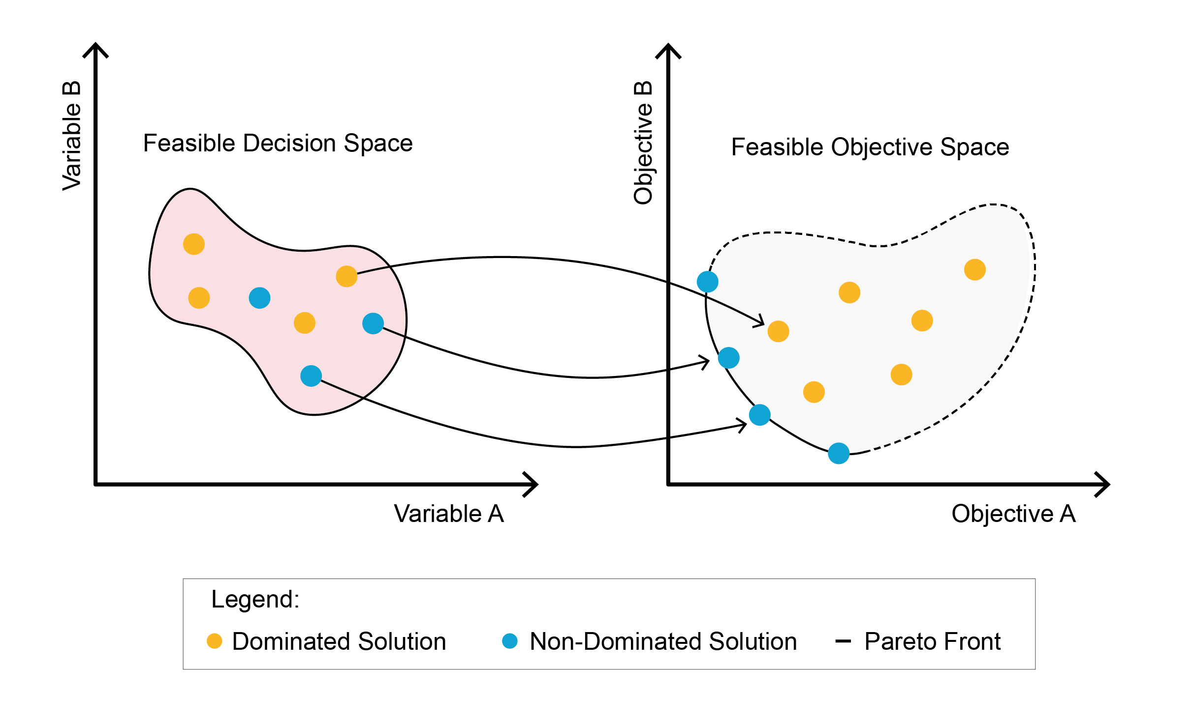
A Pareto Front plot is a graphical representation of the multi-objective optimization results. The axis of the plot are the optimization objectives and each point on the plot represents a solution. In the plot there is a utopia point where all the objectives achieve the best possible value. This point does not exist. Instead, the relationship to the utopia point represents how optimal the solution is. The utopia point does not exist as a solution because in multi-objective optimization, the objectives often conflict.
Therefore, a multi-objective optimization problem results in several optimal solutions that represent the compromise between conflicting objectives. These solutions are called non-dominated solutions, which form the Pareto (optimal) set or the Pareto Front. The other solutions which have at least one other solution better in at least one objective are the dominated solutions. For more information you can watch this video about the pareto front:
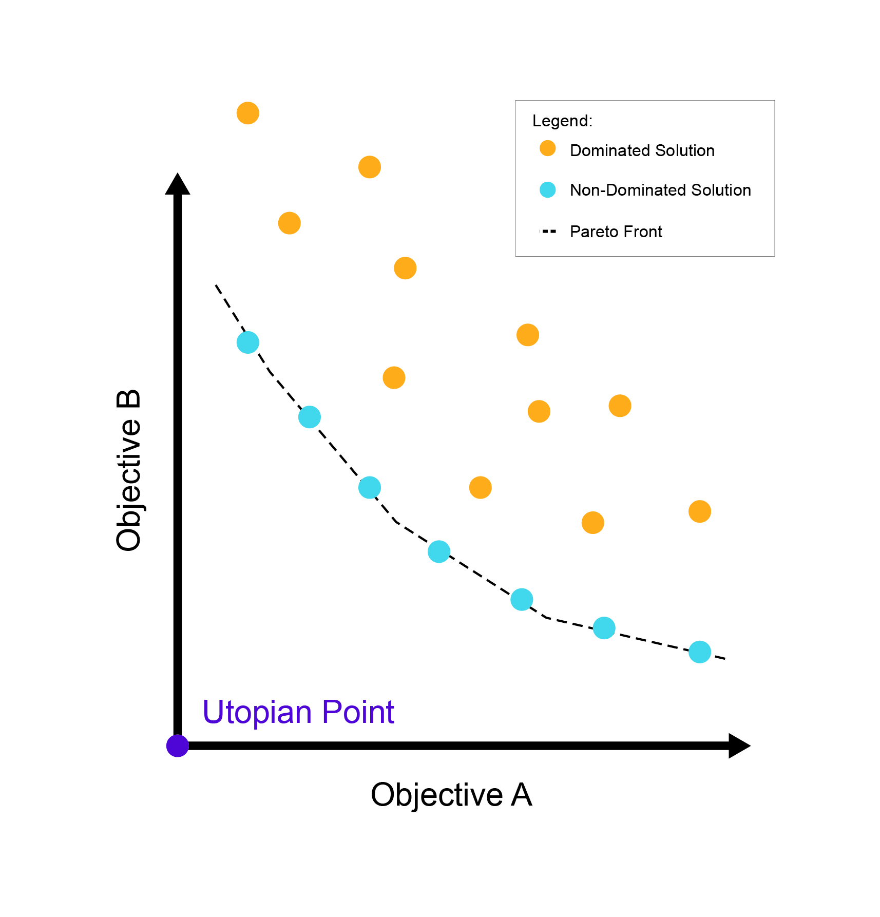
Non-dominated solution: A solution that is equally optimal considering the objectives. No other solution is better in at least 1 objective.
Dominated solution: A solution that is dominated by other solutions in at least one objective.
Utopia point: The hypothetical point where all solutions reach their best possible value.
Pareto Front: A set of non-dominated solutions in the objective space, which represents the solutions space that is superior to the rest of the solution space.
The Pareto Front represents the set of best solutions in the objective space, showing outcomes that achieve optimal trade-offs across multiple objectives. To better understand these solutions, you can also visualize all solutions in the decision (or variable) space, where each point represents a solution based on its input variables. In this decision space, you can identify the non-dominated solutions, which form what is called the Pareto Optimal Set. In other words, the Pareto Optimal Set is simply the representation of the Pareto Front within the decision space, showing the configurations of input variables that lead to the best trade-offs in the objective space.
Non-dominated solution in decision space (left) and in objective space ( right)
Drawing Conclusions from a Pareto Front Graph
It is important to note that there is no single optimal solution in multi-objective optimization. There will always be a trade-off between the different objectives. This is why all solutions on the Pareto Front are optimal solutions. The way you can analyse these solutions and narrow them down is by understanding the priorities of the decision maker. In design this may result in you discussing trade-offs with a client to pick a design direction. In research, it allows you to draw additional conclusions based on the optimization results.
In a Pareto Front, the solutions at the endpoints tend to represent optimal solutions for the objective represented on that axis. The solutions that are in the middle of a curve or surface, tend to represent more balanced solutions. The shape of the Pareto Front can also give you information on the relationships between the solution. The simplest shape a Pareto Front can have is a line or flat plane. A linear front demonstrates that the trade-offs between objectives is proportional and predictable. Losses in one objective correspond closely with improvements in another objective. A convex shape suggests that the objectives have a straightforward trade-off between them. An improvement in one objective results in a predictable, proportional deterioration in the other(s). A concave shape indicates a more complex trade-off. A small improvement in one objective may require a significant sacrifice in the other(s). This shape can also suggest that there are diminishing returns to improving one of the objectives as it quickly becomes costly for the other objectives. A discontinuous or fragmented front suggests that there are groups of solutions or may suggest that certain solutions are not viable. This fragmented front can also suggest that there are constraints or conflicting objectives that lead to some parameter values not being possible for an optimal solution.
By looking at the solutions and comparing the parameters that resulted in them, you can extract what parameters lead to more balanced results or if specific parameters have a large influence on certain objectives. Additionally, you can look at not only the most optimal solutions, but also the worst ones. These may give you information on which parameter values are not feasible and can further inform your research and experiments.
With all these considerations in mind, it is possible to select one or more solutions. This will need to be based on the importance of each objective. For example, if the lowest cost solution is the only option, then you may need to compromise on other objectives. Or, if the cost needs to fall within a range, you can more easily choose parameters that result in higher performance of the other objective. In some cases, the information you receive from the optimisation may also lead you to adjust your experiment or design parameters.
Example papers
The following papers give a clear explanation on how the discussed terminology can be used during research. We highly recommend you to look at these papers.
“Zero energy potential of a high-rise office building in a Mediterranean climate: Using multi-objective optimization to understand the impact of design decisions towards zero-energy high-rise buildings” by Giouri et. al.
- ScienceDirect Article by Giouri et al., 2020
- The page below has a review on hw the pareto front is used to draw conclusions from the research. We highly recommend ready this paper page.
Debate B: Pareto front analysis
If you are following this tutorial because you are attending the course BK3WV4, after you have learned the theory and practiced the exercises, you will attend a workshop in class at TU Delft. The workshop lasts 3 hours. During the workshop, you will work with the tutors. Two hours are contact hours with your tutor and one hour is for activities without tutors. During the first one hour, you will discuss the tutorial with the tutor and your classmates. During the second hour, you will write a first draft of your workshop deliverable. During the third and fourth hour, you will discuss how the content of the workshop relates to your research question.
- What are the benefits of using Pareto front plot in comparison of a parallel coordinate plot? And why which of the two types of plots would be more beneficial for your research?
- How could you use a Pareto Front plot to analyse the results of your research?
Write your feedback.
Write your feedback on "WV4 Line 2 – Workshop 4: Analysis of results"".
If you're providing a specific feedback to a part of the chapter, mention which part (text, image, or video) that you have specific feedback for."Thank your for your feedback.
Your feedback has been submitted successfully and is now awaiting review. We appreciate your input and will ensure it aligns with our guidelines before it’s published.
