Wallacei Basics – Analysing and selecting MO-optimization results in Wallacei X
-
Intro
-
Wallacei X Tabs
-
Wallacei Analytics Tab & Diamon Chart
-
Parallel Coordinate Plot (PCP)
-
Pareto Front Solutions
-
Unsupervised Machine Learning – Clustering
-
Exporting Solutions
-
Conclusion
-
Useful Links
Information
| Primary software used | Wallacei |
| Software version | 1.0 |
| Course | BKB3WV4 – Bouwkunde als wetenschap |
| Primary subject | Analysis & simulation |
| Level | Intermediate |
| Last updated | November 27, 2024 |
| Keywords |
Wallacei Basics – Analysing and selecting MO-optimization results in Wallacei X 0/8
Wallacei Basics – Analysing and selecting MO-optimization results in Wallacei X
In this tutorial, you will learn how to analyse a multi-objective optimization for a façade panelization problem and select solutions using Wallacei. After finishing an optimization, the next step is to analyse the data and select results. In this tutorial you will learn how to use the results of a multi-objective optimization with Wallacei by analysing different metrics and selecting optimal solutions for further analysis or implementation. You will learn how to read the results and how to select the ultimate solution by analysing them through the Parallel Coordinate Plot, Pareto Front, and Machine Learning Clustering.
Exercise File
In the exercise file you can find the results of an optimization, with all the results saved and ready to analyse. You can use these optimization results to draw the graphs explained in this tutorial. Attach GH file with only the Wallacei X component with the saved results of an optimization.
Wallacei Basics – Analysing and selecting MO-optimization results in Wallacei X 1/8
Wallacei X Tabslink copied
There is no ultimate best solution with multi-objective optimization problems. The fittest solution in terms of objective 1 may not be the fittest for objective 3 at the same time, and vice versa. So, selecting results means is always a compromise. Therefore, it is very important to do thorough analytics of the data.
Inside the Wallacei X component there are two tabs to use for the analytics and selection of the optimization results.
Wallacei Settings Tab
After the optimization is completed, your Wallacei Settings tab will look as follows. If you just ran the optimization and did not close the Wallacei screen yet, you will still see all the results (left). If you opened a saved Wallacei component your screen will be empty (right). No worries, all the information is still there.

Wallacei Analytics Tab
Wallacei Analytics is a group of components used to analyse the fitness values outputted by an evolutionary simulation. In most cases, the multi objective optimisation does not output a one-fits-all solution, there is more nuance to the results, we must find a balance between optimised objectives and their possible trade-offs. The aim is to provide users with a thorough understanding of the population’s fitness values through their analysis and presentation by means of a range of methods, each highlighting a unique aspect of the outputted results. Unlike WallaceiX, the following analytic tools can be used independent of the evolutionary algorithm, even after restarting Rhino, assuming everything was saved properly.
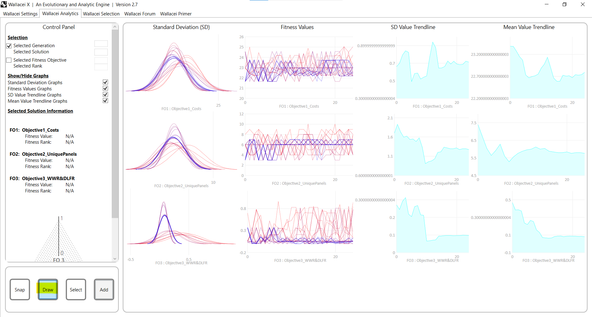
You can simply start using the Wallacei Analytics tab by clicking on ‘Draw’ at the bottom left. The results of the optimization will show.
To learn more about using the Wallacei Analytics tab for analysing simulations results, watch this video from Wallacei.
Wallacei Selection Tab
In the Wallacei Selection tab you can analyse the results in more detail and select specific solutions for export. The Wallacei Selection tab is equipped with extensive analytical tools and selection capabilities to help you filter through hundreds or thousands of options. We will walk through the Parallel coordinate plot, the pareto front, and unsupervised clustering to analyse and select results. In this tutorial we will explain the 4 methods you can use to analyse the results.
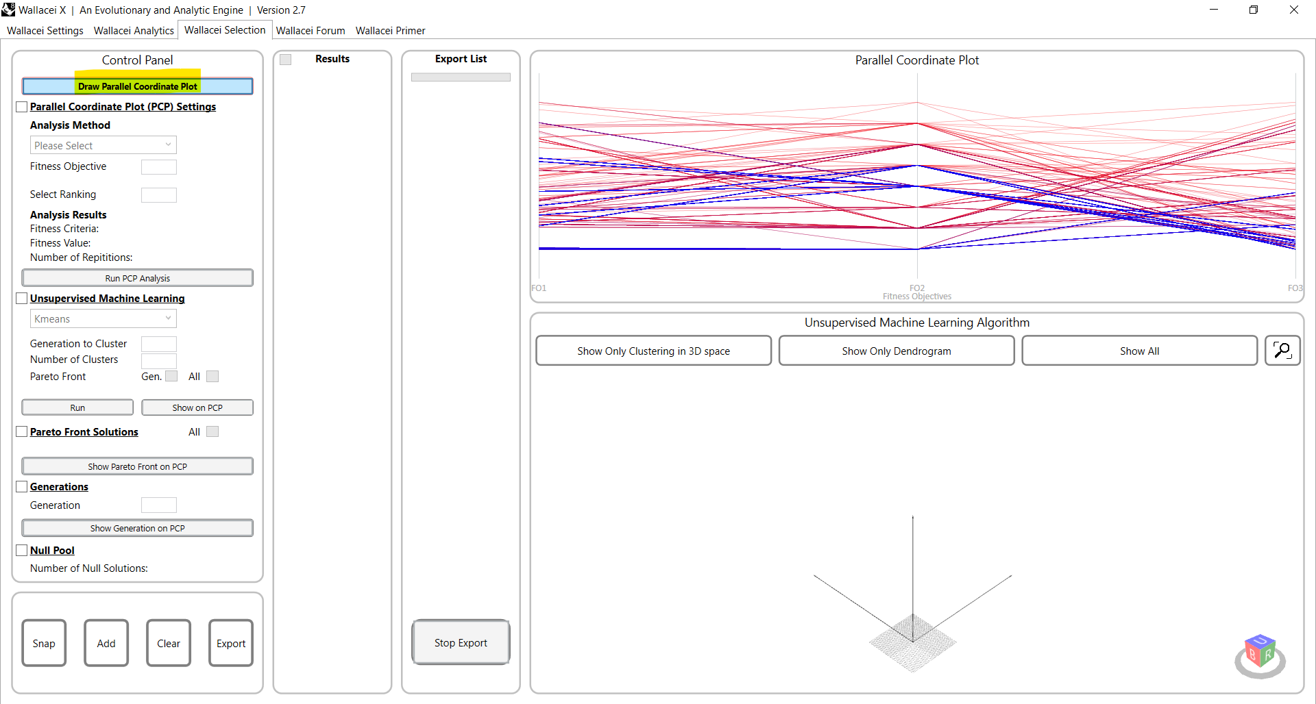
You can simply start using the Wallacei Settings tab by clicking on ‘Draw Parallel Coordinate Plot’ at the top left. The results of the optimization will show.
This Wallacei video explains how to use the Wallacei Selection tab so analyse and select solutions.
Wallacei Basics – Analysing and selecting MO-optimization results in Wallacei X 2/8
Wallacei Analytics Tab & Diamon Chartlink copied
Wallacei Analytics tab overview
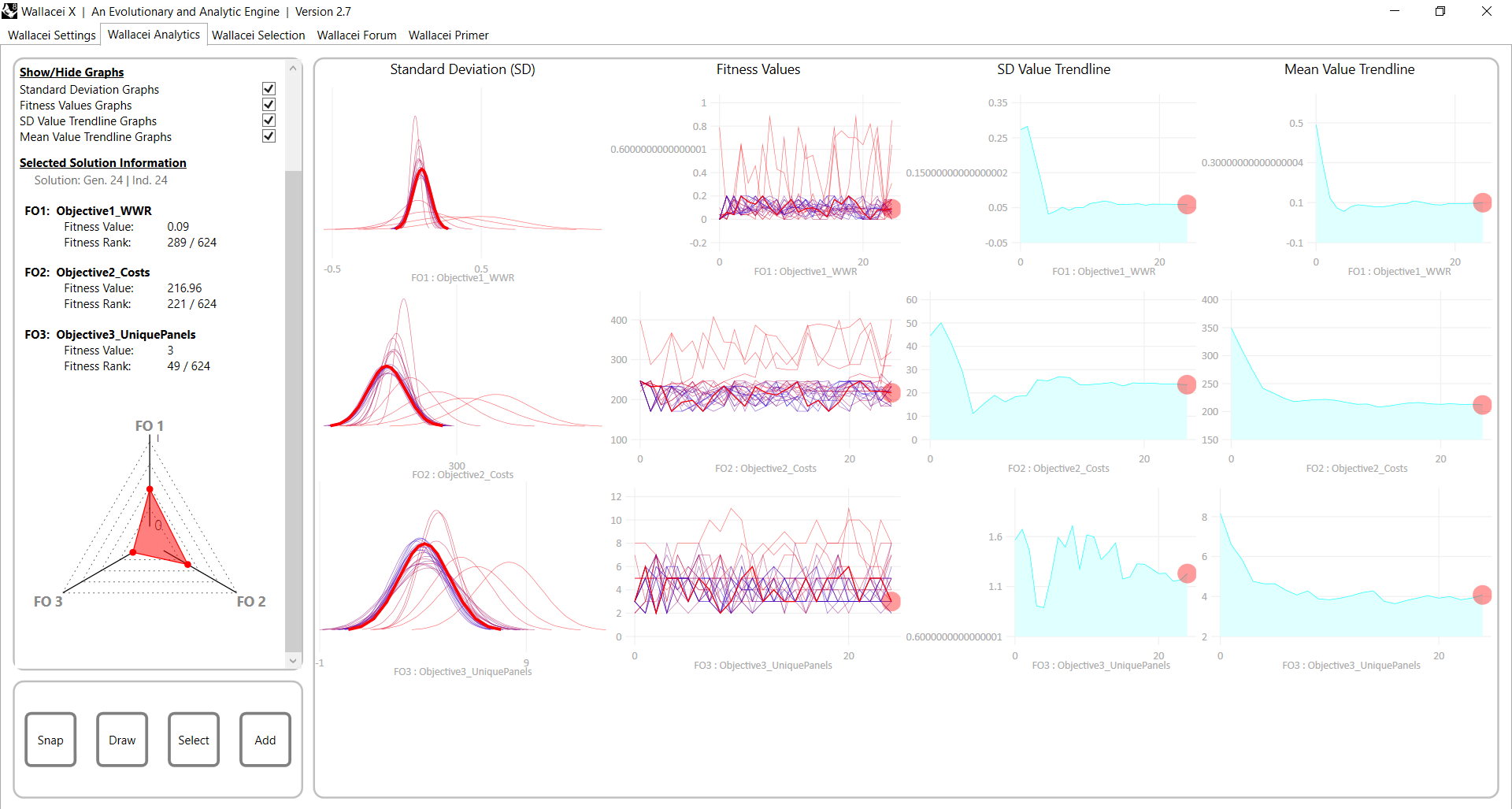
In the Wallacei Analytics tab you can take a closer look at each generation or specific solutions. You can choose them in the Control Panel, and then click “Draw” (at the bottom left). The solution will be highlighted as a red circle on the charts. You can examine the diamond chart, showing one solution’s fitness on each objective.
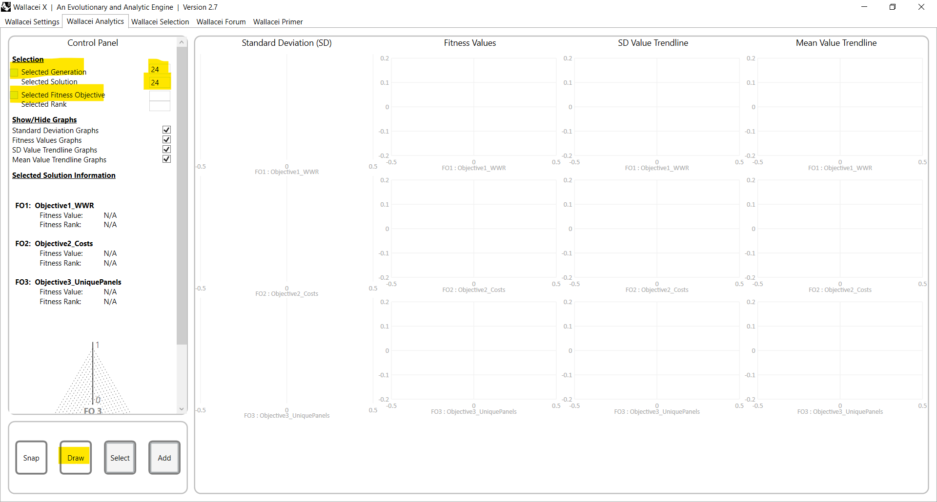
When you open it is empty. To see, select a solution you want to analyse. You can start with the last produced solution. In this case 24,24, click on Draw.
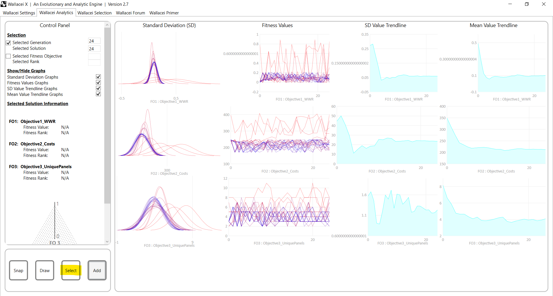
You will see this. Alternatively, you can also show where in the analytics space the solution is located. Click on ‘Select’.

It looks as follows. In the next steps we will go into all the 5 diagrams to see what they mean and how you can use them.
Diamond Chart
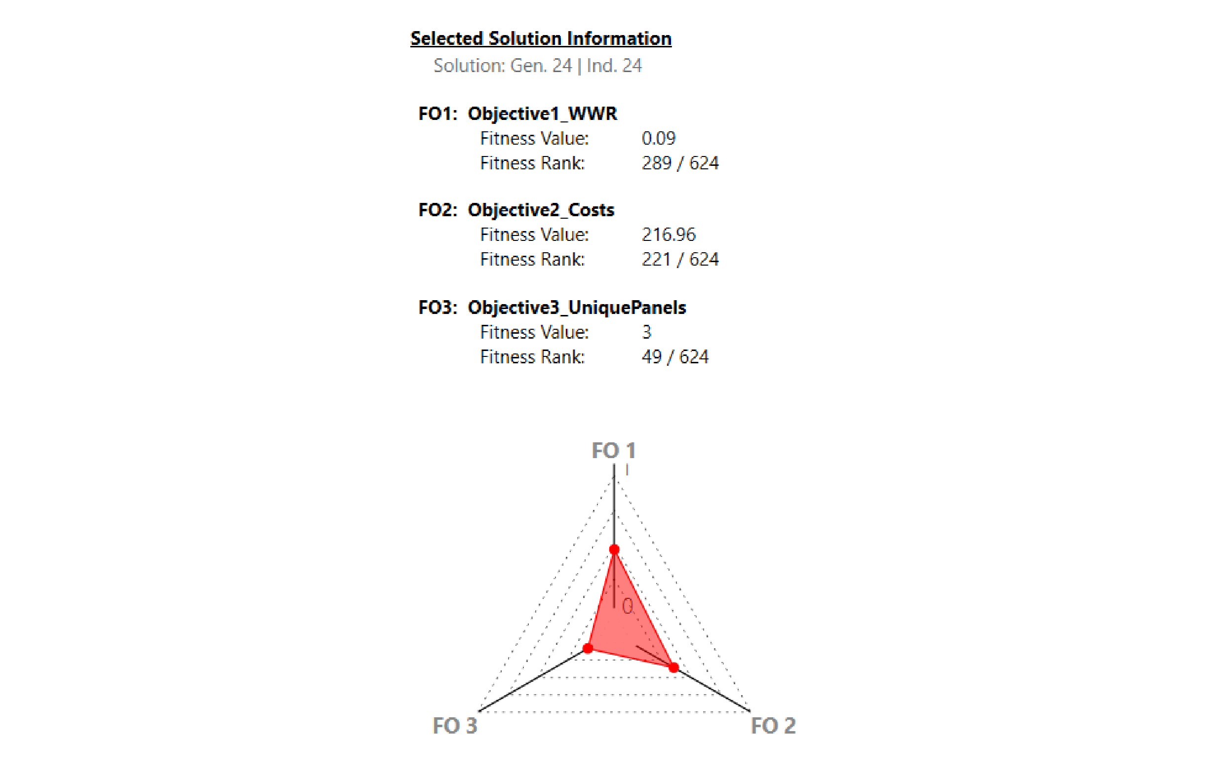
Sometimes referred to as “star coordinate method”, the Diamond Chart analyses the fitness values of single solution, and not the whole population. It shows how a single solution performs in terms of its individual values and fitness objectives, helping the user to understand those relationships in more detail for chosen solutions.
Standard Deviation (SD)
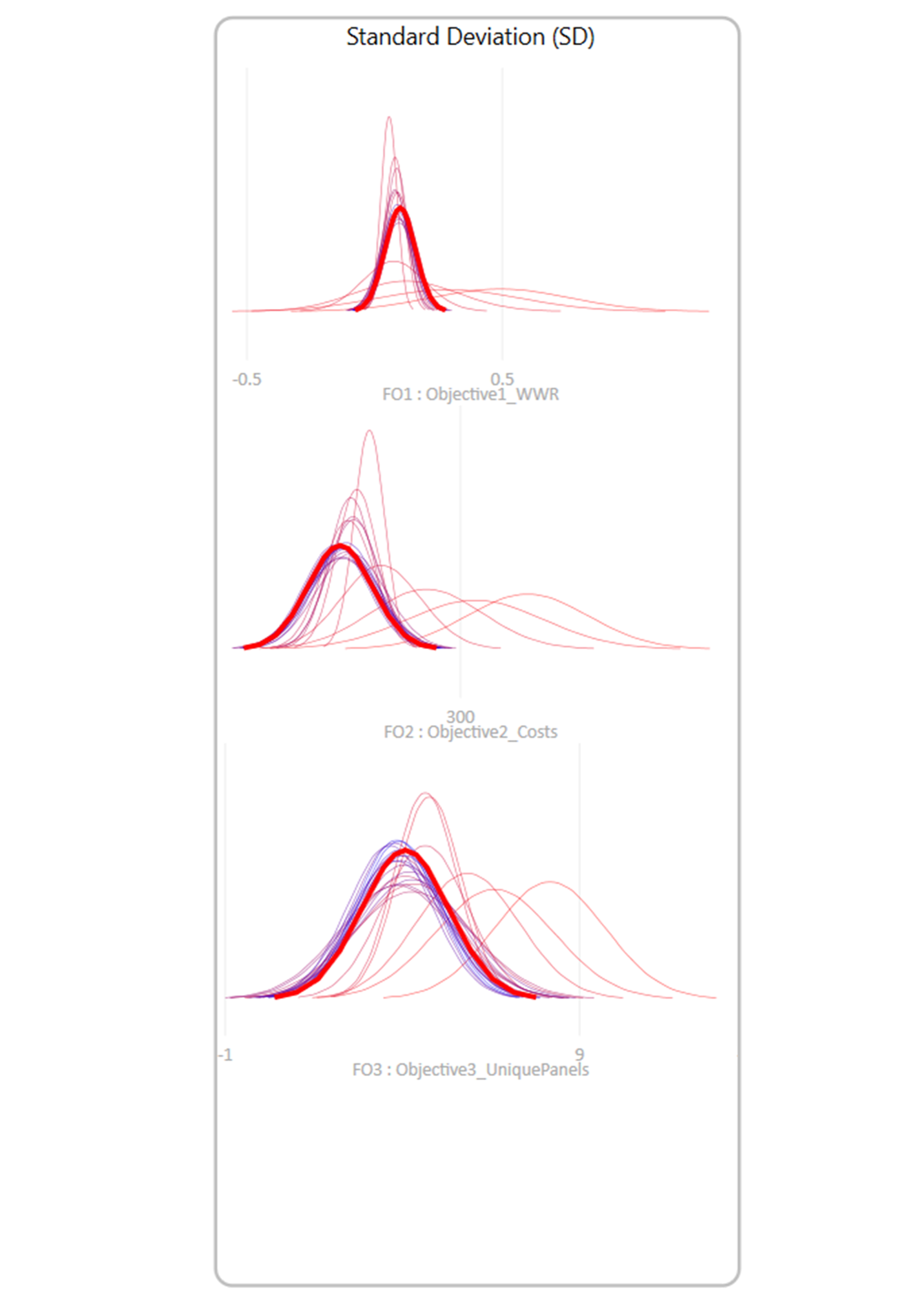
The Standard Deviation Graph’s main purpose is to show how much the solutions change over iterations for each objective. Each curve represents the range of solutions in a single generation/iteration. The narrower the curves, the more stable and consistent the solutions are. The wider the curves, the more variation there is. In this example, you can see that the WWR becomes the most consistent and stable over time, while the unique panels’ objective is wider meaning it’s more varied and it’s having a harder time finding a stable solution. This graph helps track how the optimization process refines solutions over time.
Fitness Values
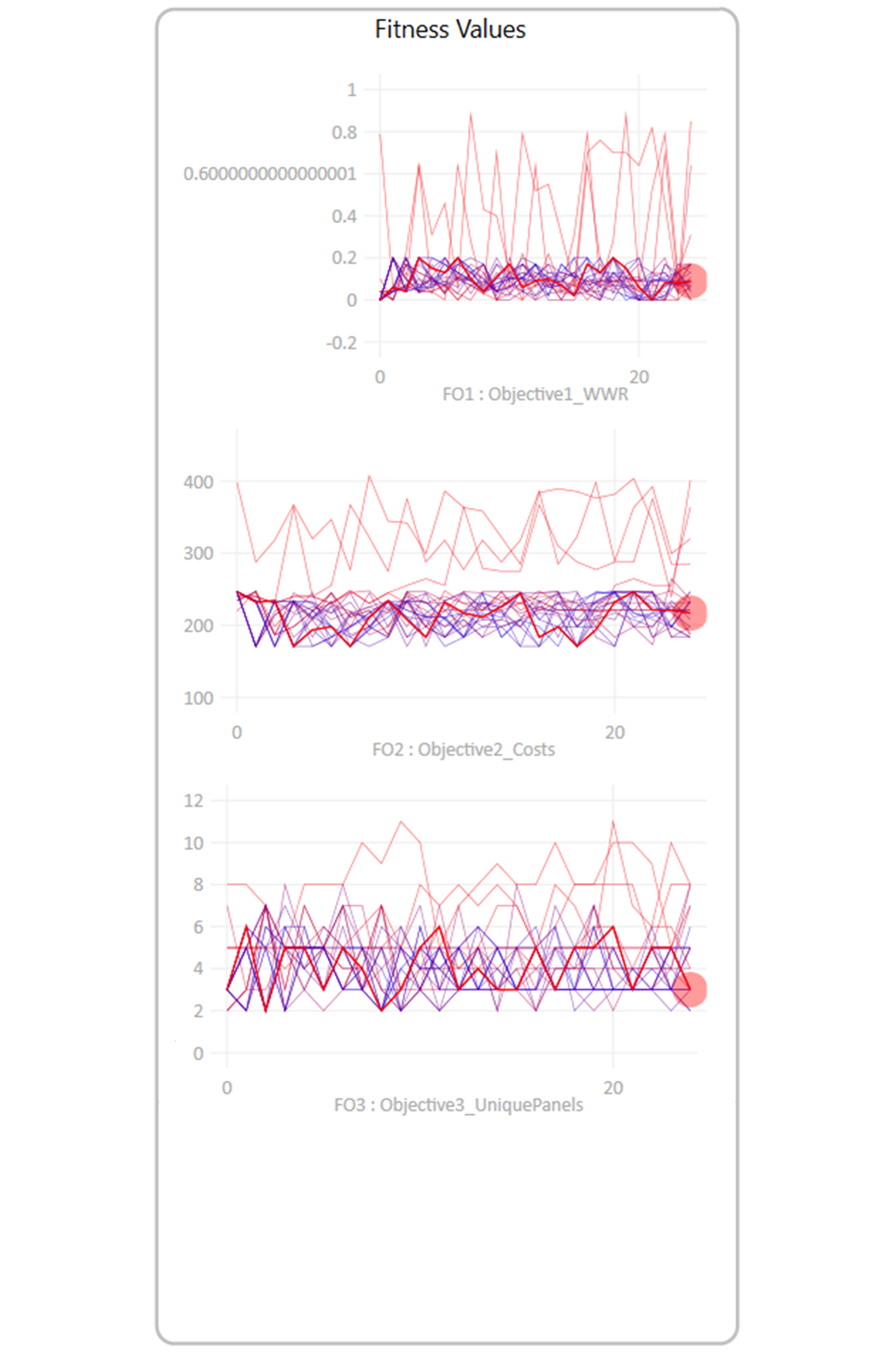
The Fitness Value Graph tracks the performance of the solutions over the iterations for each goal. Each line represents the fitness values of each solution across the iterations, basically checking how well they are doing to reach that objective over time. For the WWR and the cost, you can see that the solutions are more scattered in the beginning, but they eventually improve more towards our goal. However, the values keep fluctuating for the unique panels objective, clearly showing that its more difficult to achieve that objective. This graph helps visualize how each objective’s solutions evolve and whether they converge toward optimal results or continue exploring diverse possibilities.
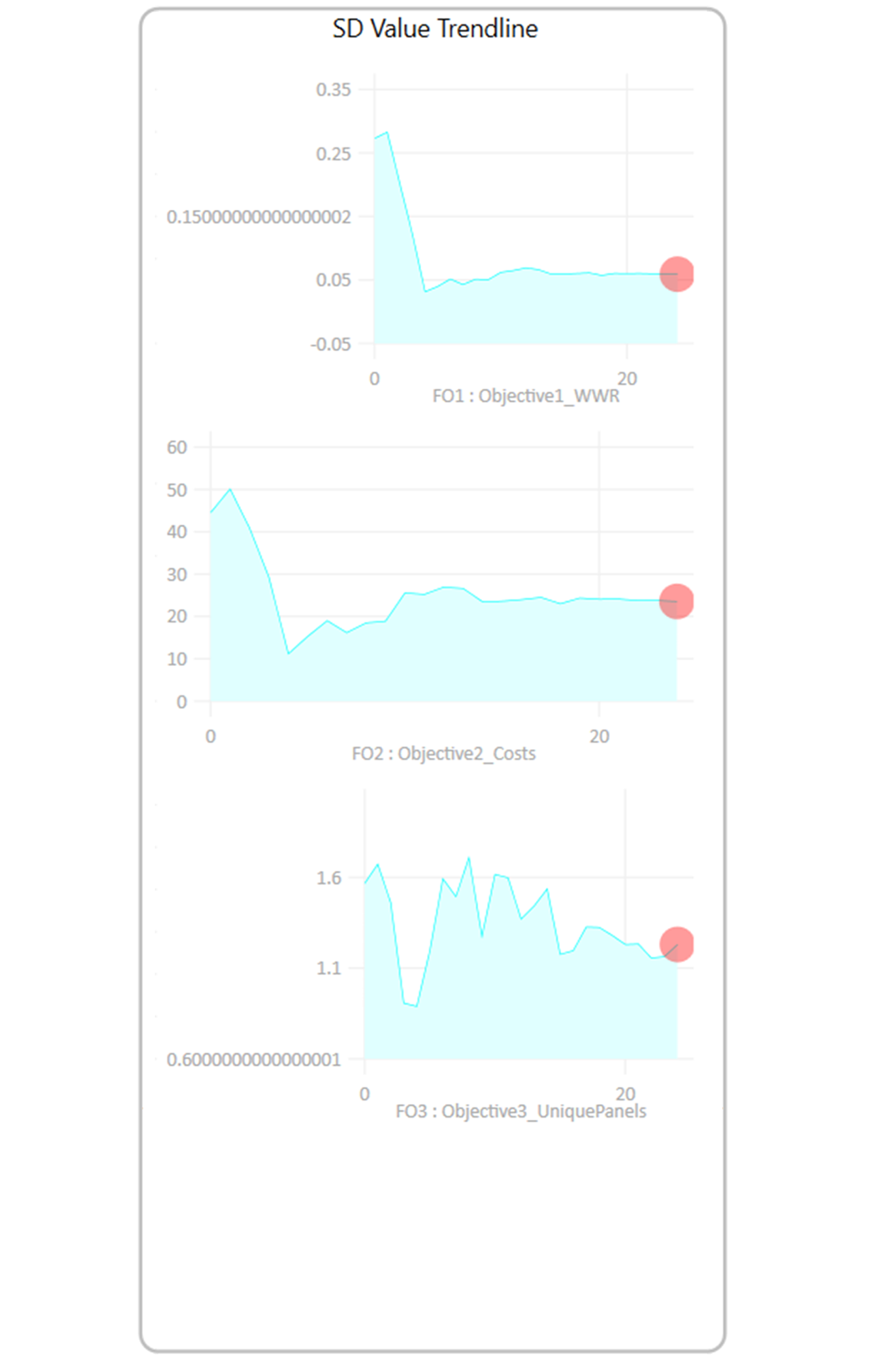
The SD Value Trendline tracks how the standard deviation of each objective changes across the different iterations, showing whether the solutions in the population are becoming more stable or remain varied. For the WWR objective, the trendline quickly flattens, indicating that the solutions coincide and stabilize early. In the cost’s objective, there is also an initial drop followed by some fluctuations. This shows that it took a little more time for solutions to stabilize. For the unique panels’ objective, the standard deviation keeps fluctuating throughout, showing that variability remains, the algorithm is still trying out different options and hasn’t fully stabilized. This graph provides insight into the optimization process by highlighting when each objective achieves stability or continues evolving.
Mean Value Trendline
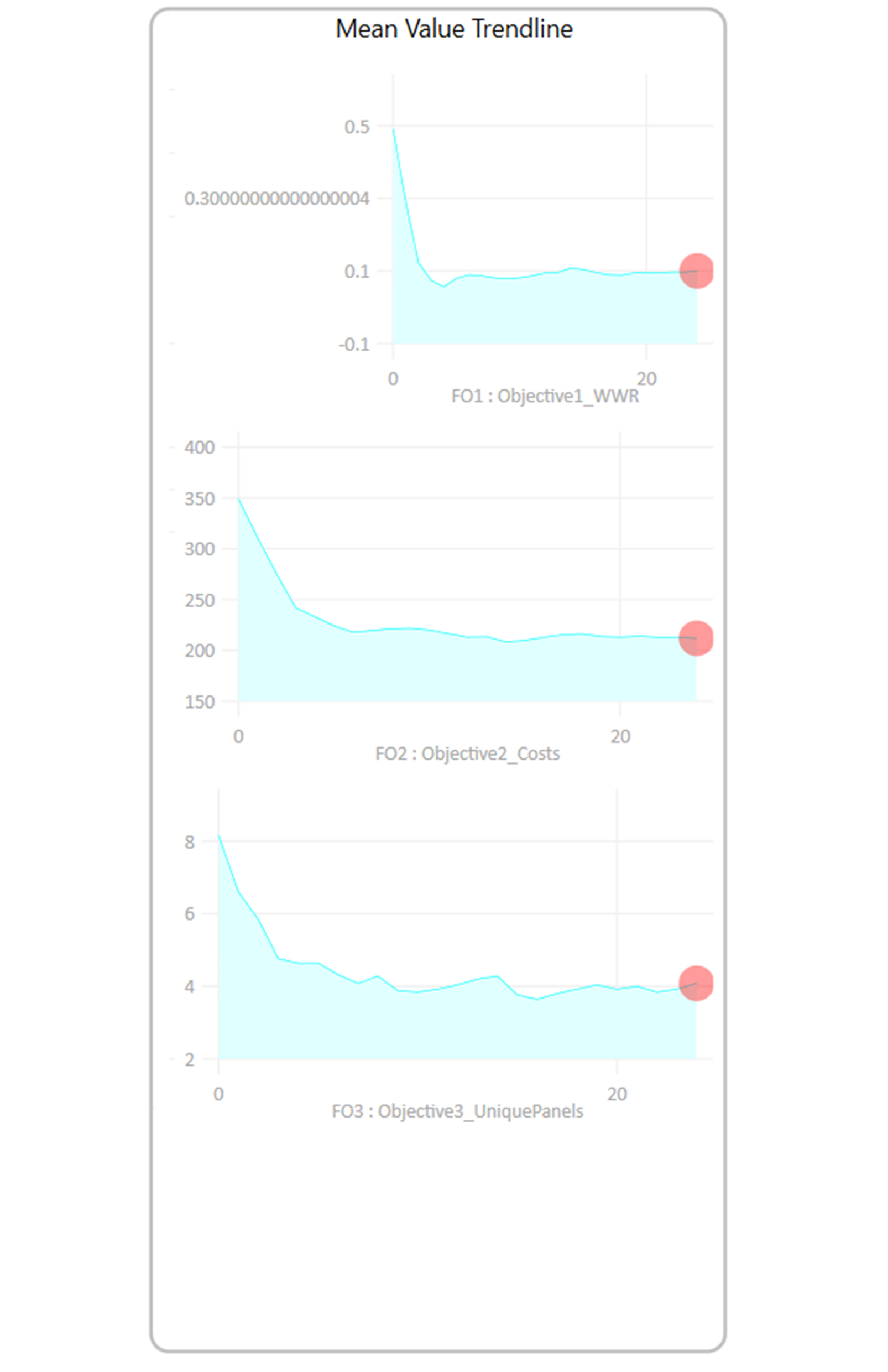
The Mean Value Trendline tracks the average performance of solutions across iterations for each objective. In the WWR objective, the initial values are scattered but quickly stabilizes, showing rapid progress toward optimization. The cost objective starts with high values and gradually decreases, stabilizing as more cost-efficient solutions are found. For the unique panels’ objective, the values decrease steadily, but some fluctuations remain, suggesting the algorithm is still exploring various configurations. This graph helps visualize how each objective’s solutions evolve and whether they are converging toward optimal values or continuing to explore diverse possibilities.
To learn more about this part of analysing simulation results, watch this video.
Wallacei Basics – Analysing and selecting MO-optimization results in Wallacei X 3/8
Parallel Coordinate Plot (PCP)link copied
The Parallel Coordinate Plot (PCP) analyses all solutions in the population by comparing the fitness values to one another, displaying every solution as a line, going up or down as fitness values change.
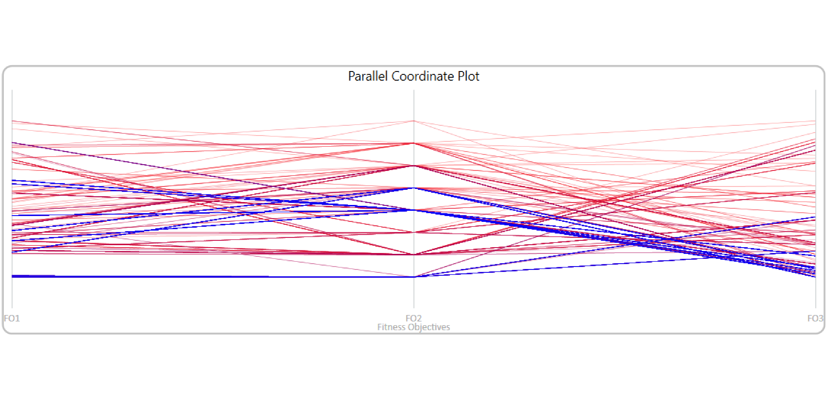
In the “Parallel Coordinate Plot” you can see solutions as lines, going up and down depending on each objective fitness. Red means the oldest, and Blue means the newest. It helps understand how the solutions relate to each other, and how each fitness values influence others, or not.
You can investigate the parallel coordinate plot in two ways with Wallacei, through the Wallacei Selection tab or by visualizing the results in Grasshopper with the Wallacei analysis components. In this chapter, we will show you how to analyse and select solution with the parallel coordinate plot inside Wallacei.
Another way to use the Parallel coordinates Plot, interactively, is to use the Design Explorer, available online at the Design Builder website. You can follow this tutorial, where we export results from Wallacei and explain how to use Design Explorer effectively to analyse the results more thoroughly.
Wallacei Selection tab
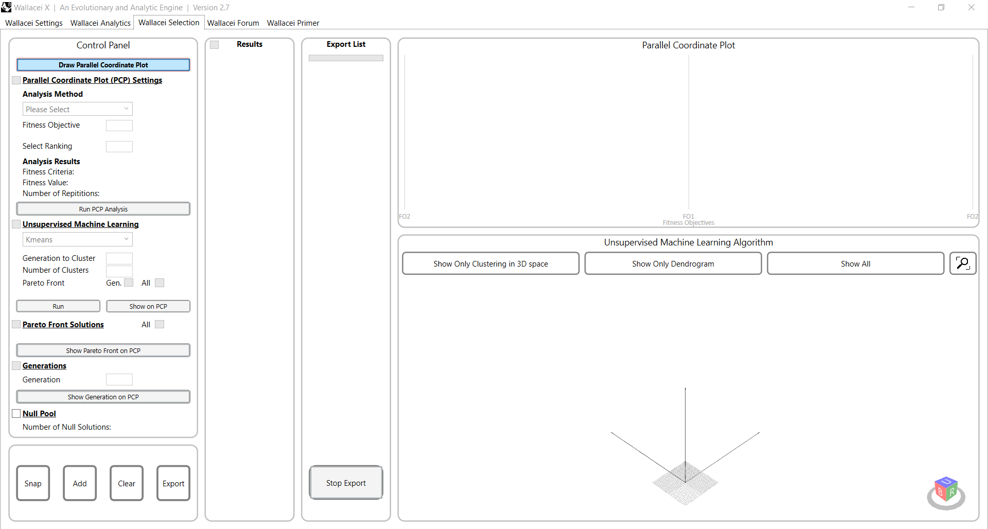
The Parallel Coordinate Plot can be analysed in the Wallacei Selection tab. When you open the Wallacei Selection tab, all the graphs will be empty. You can start with looking into the parallel coordinate plot. Draw the parallel coordinate plot by clicking on the button in the left top corner.
The coordinate lines will appear, which you have seen while the optimization algorithm ran. Now it is time to investigate these results.
Repeated fitness values
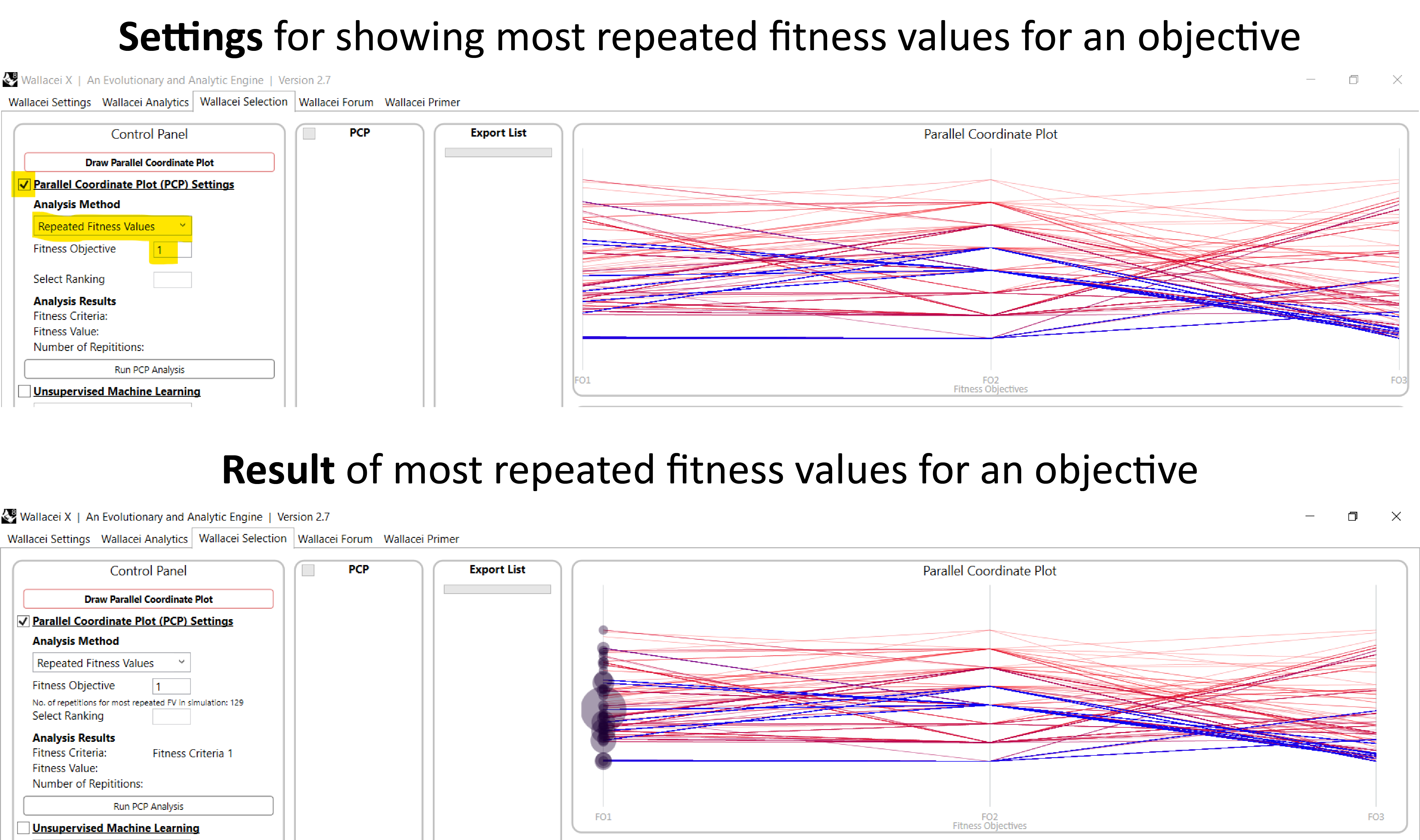
The first Analysis Method is “repeated Fitness Values”, which shows how often, depending on the objective chosen, a certain value occurs. Check the box of ‘Parallel Coordinate Plot (PCP) Settings’ and change the analysis method to ‘Repeated Fitness Values’. To show the most repeated fitness values of an objective you can write the number of the objective you want to investigate and click on “Run PCP Analysis”.
You can see that circles now appeared on the objective 1 column; they indicate how often certain values are repeated. The biggest circles show the location of the most repeated fitness values. Bigger bubbles at the bottom indicate the greatest fitness.
Select solution(s) with repeated fitness values
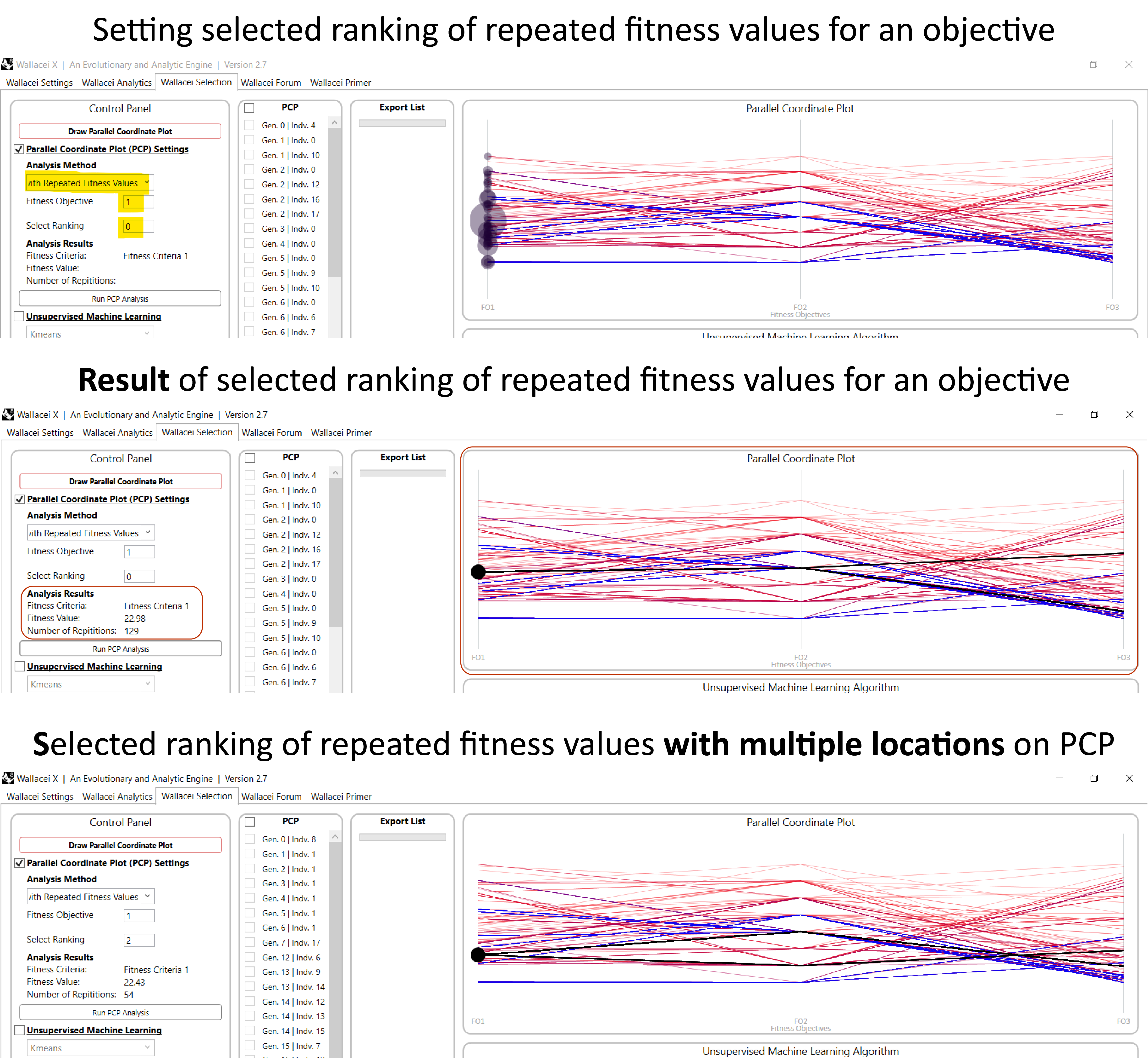
After you have investigated the most repeated fitness values per objective, you can dive deeper into the analysis by selecting the solutions with the most repeated fitness value to see how the solutions are located on the parallel coordinates plot. Change the analysis method to ‘Solutions with Repeated Fitness Values’. Next write down the objective number and ranking of the solution you want to investigate.
The selected raking with the solution will show on the PCP, highlighted in black, and you can find the analytics results on the left side. It is possible that the selected ranking of repeated fitness values results in different objective fitness for the other objective, if this is the case you will see multiple lines in the PCP.
Adding solutions to export list
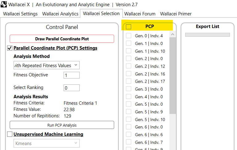
After you click the “Run PCP Analysis”, you can see in the next window to the right all the solutions with the repeated fitness value. From this list you can select solutions and add them to your export list.
Relative difference between fitness values
The third option is the ‘Relative difference between fitness values. This analysis method orders solutions based on the relative difference between fitness ranks of the objectives. Meaning, that the solution with the best rank is the solution with the same rank of all fitness objectives.

Change the analysis method to ‘Relative difference between fitness ranks and write down the ranking of the solution you want to investigate.
Average fitness values
The last option is the ‘Average fitness ranks’. This analysis method orders solutions based on their mean fitness by calculating the mean fitness ranks of the objectives. Meaning, that the solution with the best rank is the solution with the lowest mean fitness rank.

Change the analysis method to ‘Average fitness values’ and write down the ranking of the solution you want to investigate.
Generations
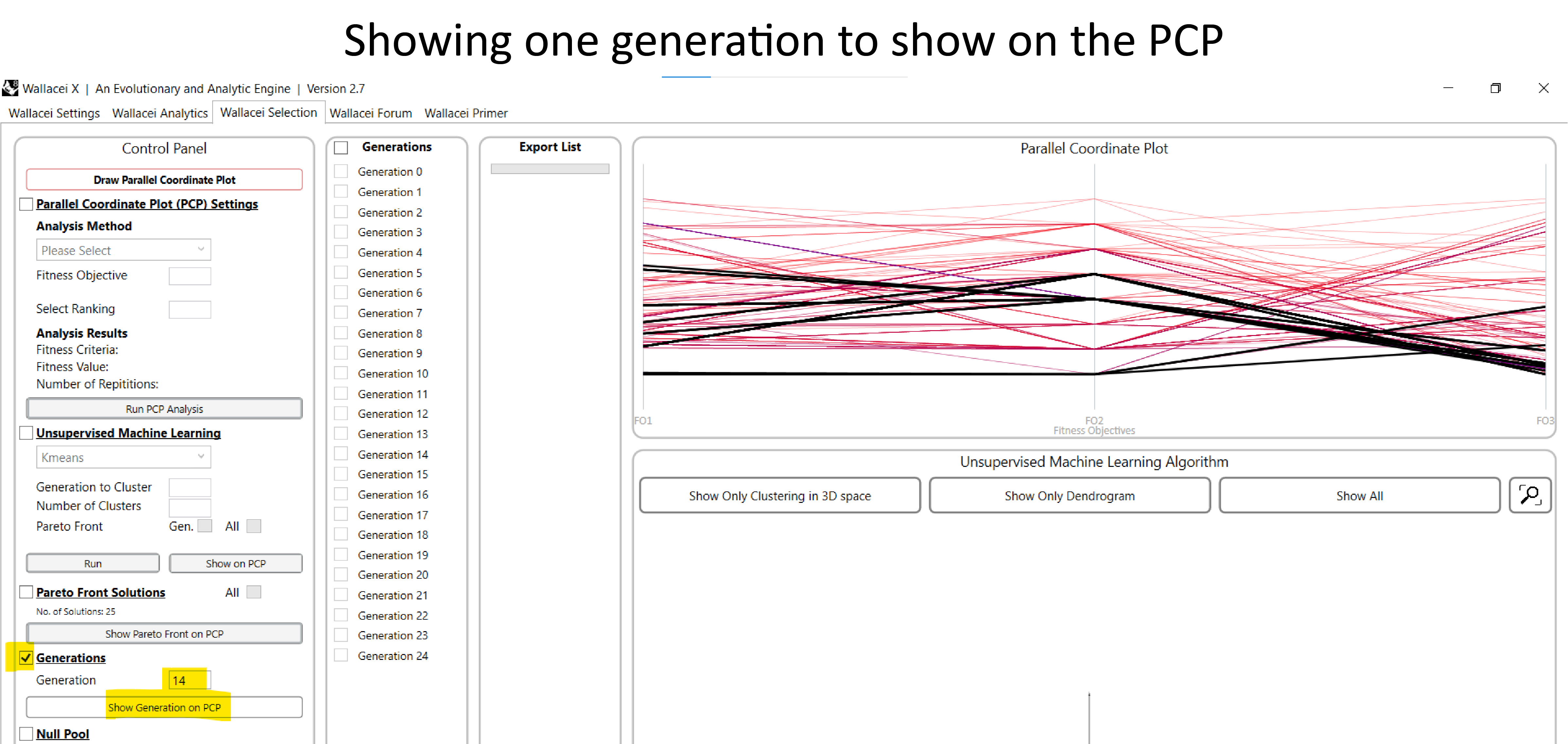
You can also investigate generations on the Parallel Coordinate Plot. Check the box ‘Generations’. In the solutions list all the generations will show, here you can select one generation and add the generation to the export list.
In the control panel you can also select one generation and show the generation on the PCP.
Wallacei Basics – Analysing and selecting MO-optimization results in Wallacei X 4/8
Pareto Front Solutionslink copied
Pareto Front Solutions, are potentially the fittest solutions out there, ranging in their individual objective fitness. It is possible, however, that some of them might not fulfil all the constraints or other hard criteria you might want, so selecting only pareto front solutions might not give you all great solutions you might want.
Objective Space and Pareto Front
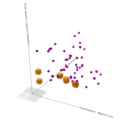
The Objective Space (OS) and Pareto Front (PF) components are recommended to be used together. While Objective Space can be used on its own, Pareto Front component needs the Objective Space to work. The Objective Space component displays the objective space of all generations. The Pareto Front component calculates the non-dominance value and draws the Pareto Front for any given generation. This is incredibly helpful when analysing the solution space, to find the “most optimal” solution.
You can investigate the Pareto Front (PF) in two ways with Wallacei, through the Wallacei Selection tab or by visualizing the results in Grasshopper with the Wallacei analysis components. In this chapter, we will show you how to analyse and select solution with the parallel coordinate plot inside Wallacei.
You can learn more about the Pareto front in this video.
Pareto Front in Objective space
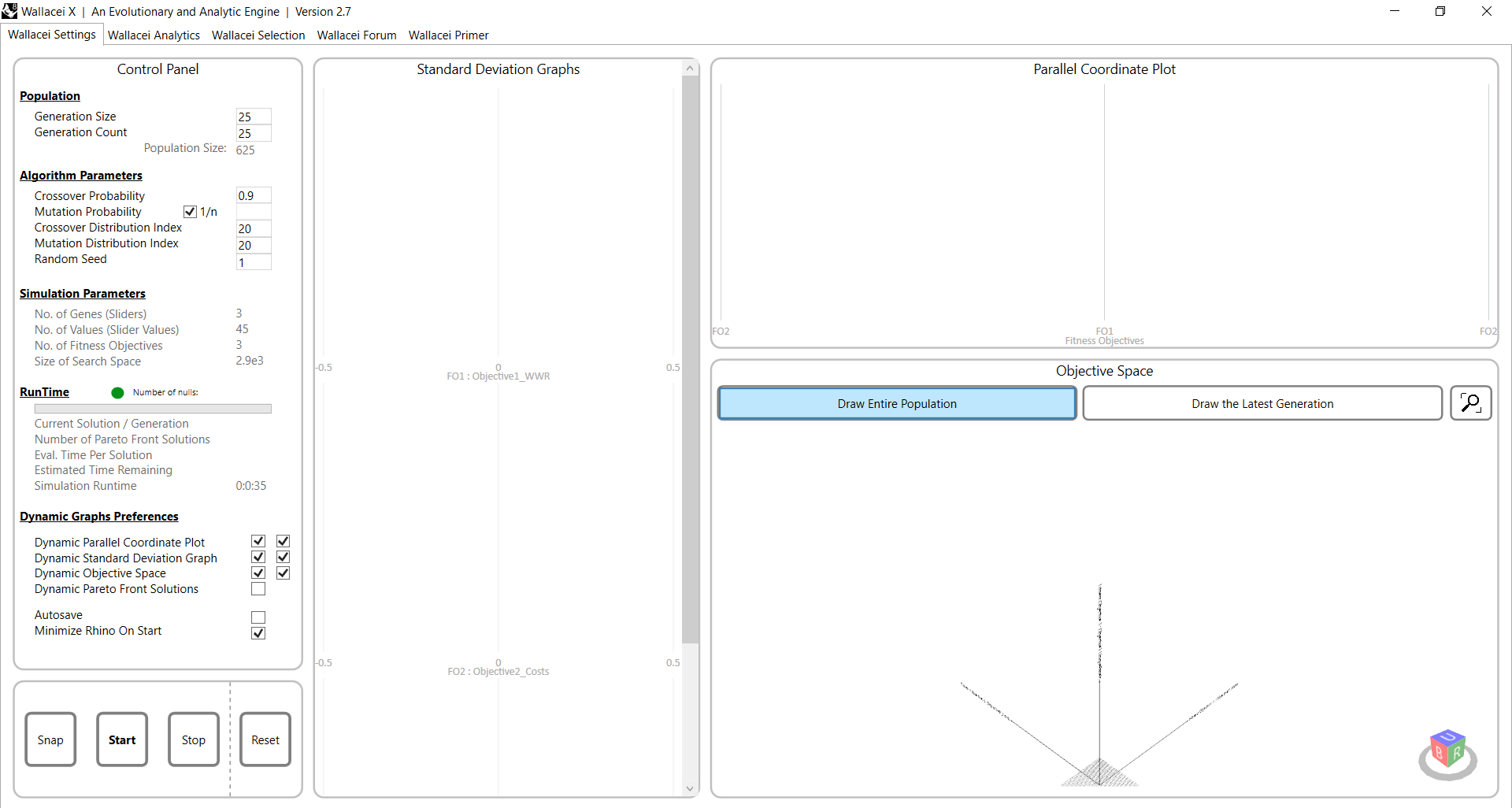
In the first tab of Wallacei X, the Wallacei Settings tab, you can visualize the pareto front in the objective space.
Let’s assume you opened a saved Wallacei optimization component that includes the optimization results. In the objective space window (bottom right) click on the “Draw Entire Population” button.
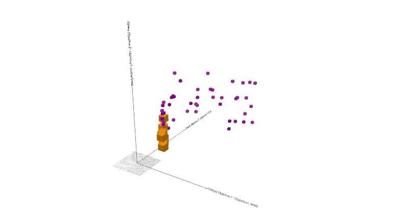
You can see all the generated options in 3D space, on axis depending on each objective fitness. The yellow boxes are highlighting the Pareto Front solutions, you can see them as essentially a range of the fittest solutions. In the objective space you can see the convergence of the solutions towards the optimum.
Wallacei Selection tab

You can also show the pareto front in the Wallacei Selection tab on the Parallel Coordinate Plot and select solutions for export.
When you open the Wallacei Selection tab, all the graphs will be empty. Draw the parallel coordinate plot by clicking on the button in the left top corner to start the analysis.
The coordinate lines will appear, which you have seen while the optimization algorithm ran.
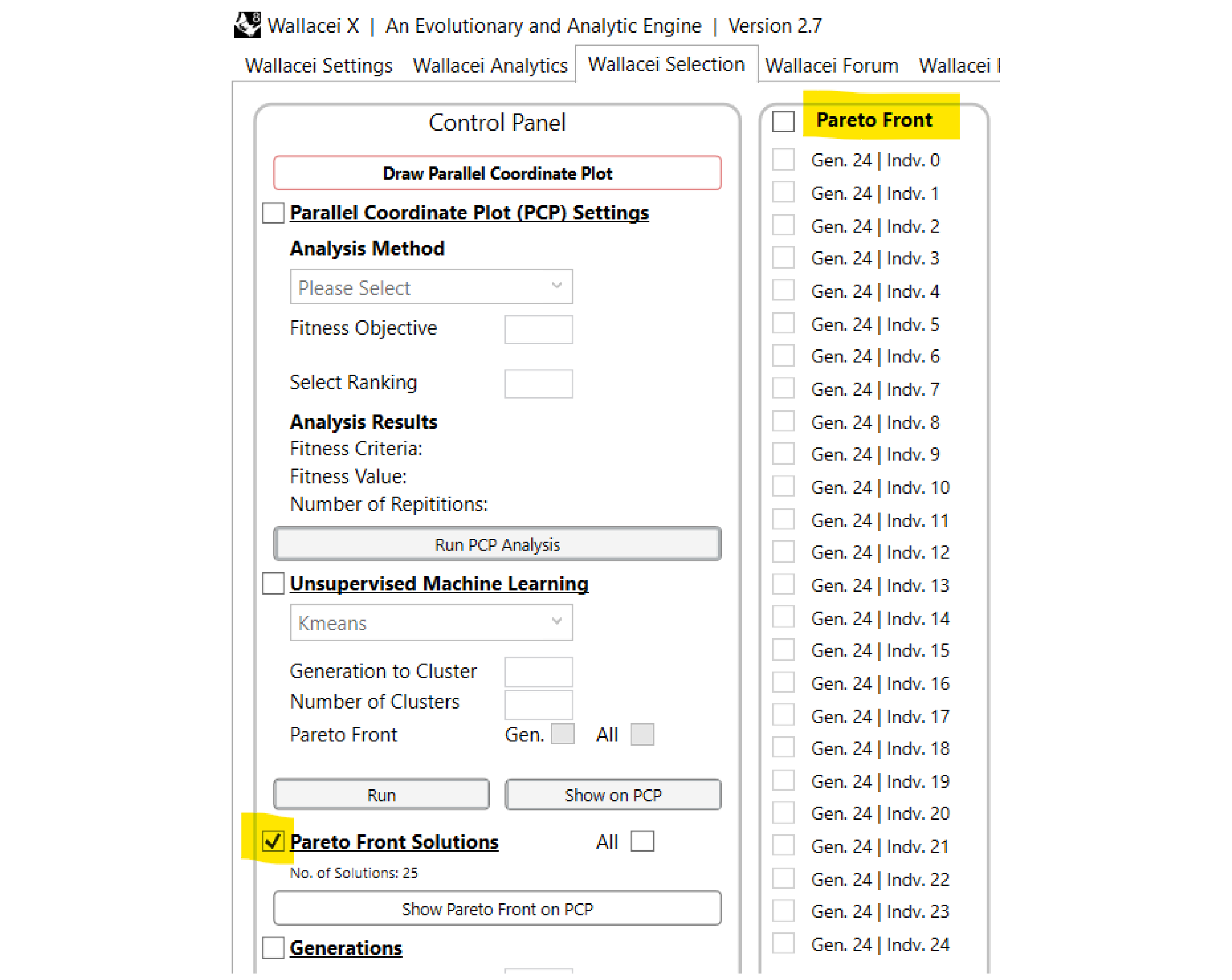
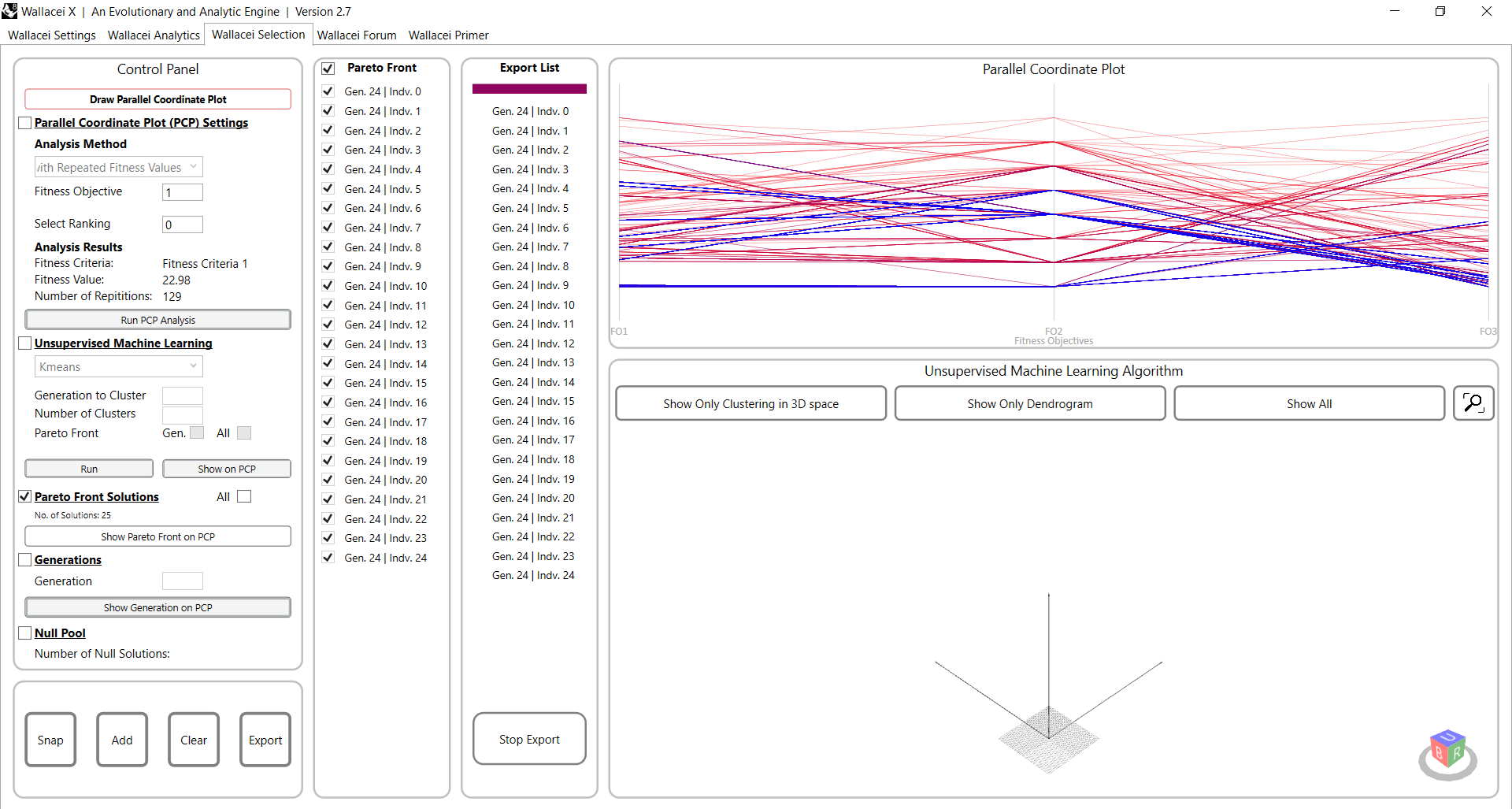
Check the box of ‘Pareto Front Solutions’ to start. After you have checked the box, in the second tab the solutions of the Pareto Front will appear for you to select them for export.
PF on the Parallel Coordinate Plot
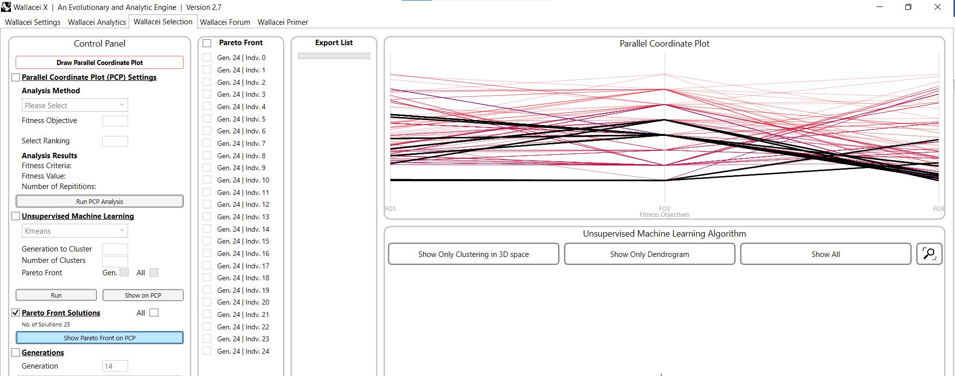
You can show the Pareto Fron on the PCP by clicking on ‘Show Pareto Front on PCP’.
You can now see Pareto Front solutions highlighted in black on the PCP. You can notice, that in our case, those are just the members of the last generation.
Wallacei Basics – Analysing and selecting MO-optimization results in Wallacei X 5/8
Unsupervised Machine Learning – Clusteringlink copied
With Wallacei X there is a k-means clustering algorithm. This is an unsupervised learning algorithm which allows you to cluster the solutions of the optimization result.
The clustering algorithm tries to divide the generation into specified number of clusters, you can think of it as solutions that are close to each other in the parameter space and share close characteristics. So, let’s say you know you would like to export solutions that are more fit on one of the objectives, then clustering comes handy, to choose similar ones together.
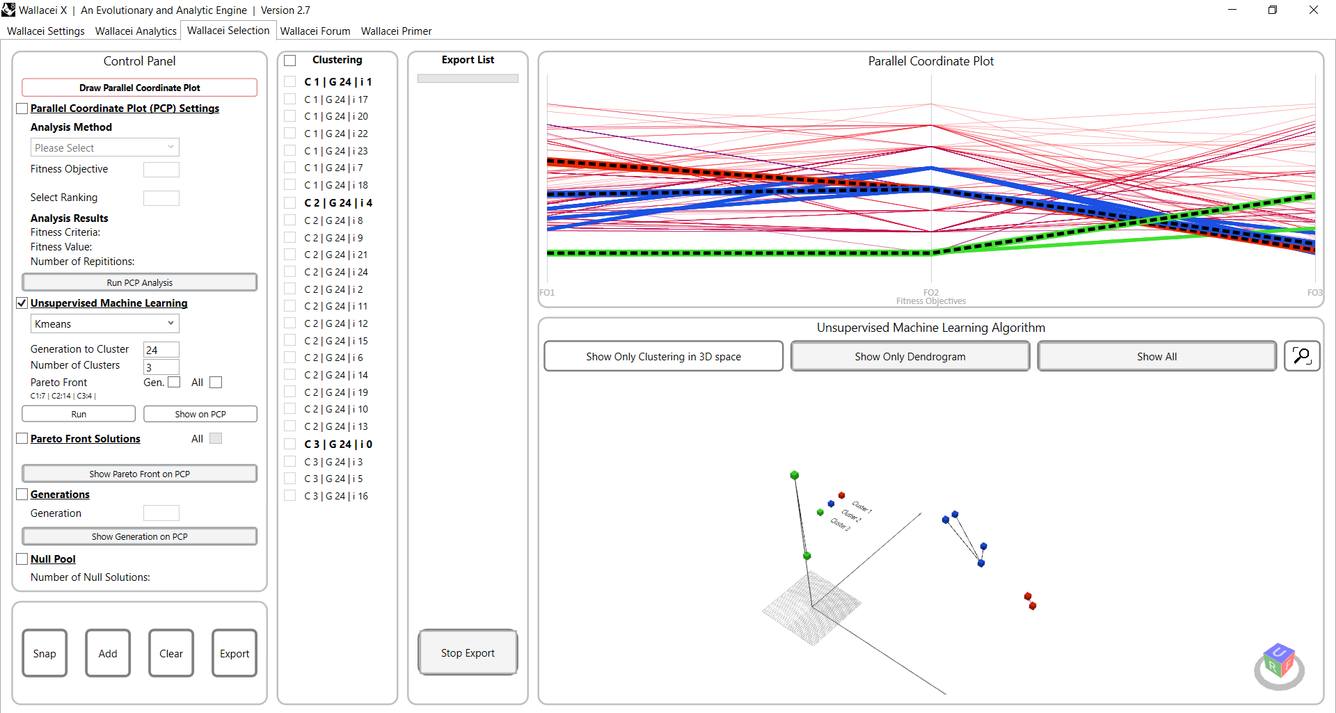
To know more about Clustering and all the Analytical Methods within Wallacei X you can watch this video from Wallacei. If you want to learn more about the theory behind k-means clustering, you can follow this tutorial:
Clustering of generation
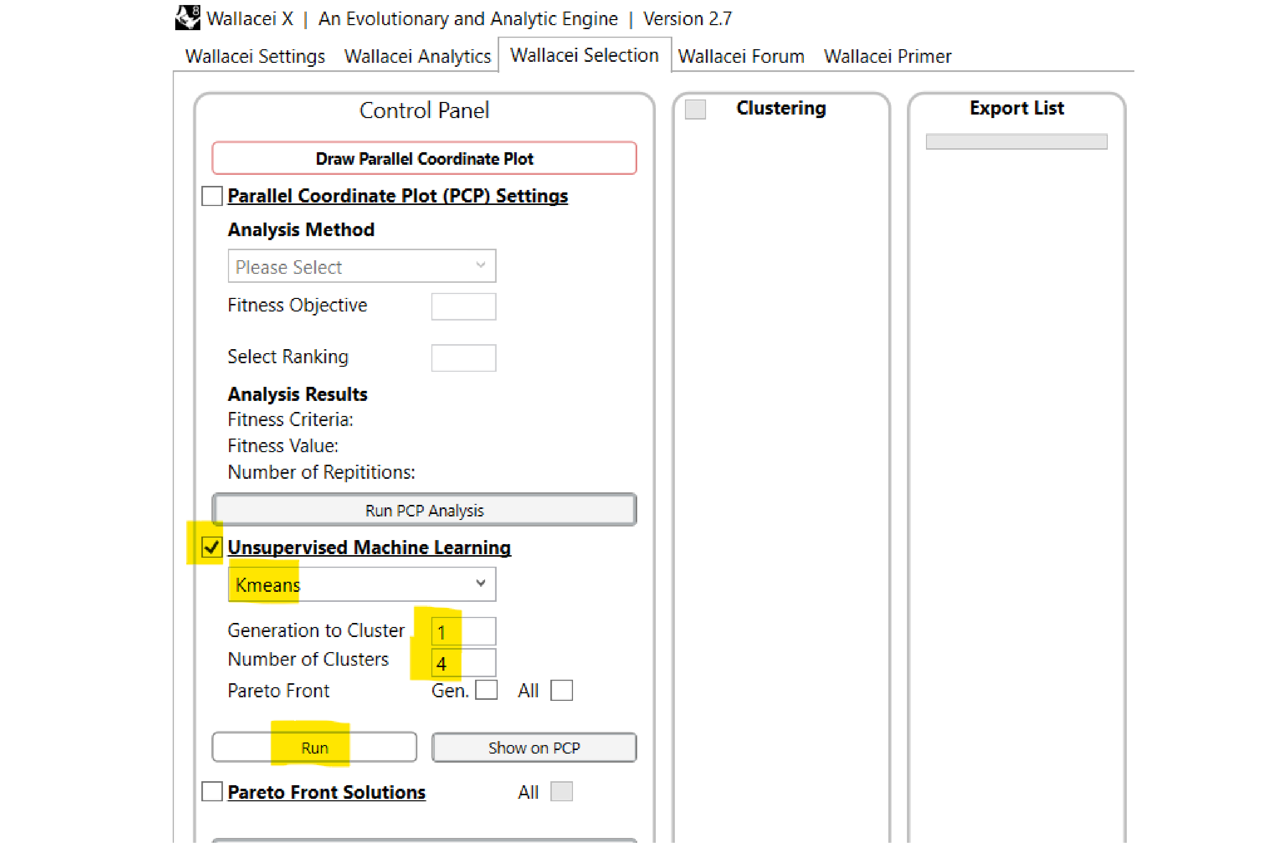
You can cluster a generation by checking the box of ‘Unsupervised Machine Learning’ and select the ‘Kmeans’ clustering method. Input the generation you want to cluster and the number of clusters you want to generate. Then click on ‘Run’.
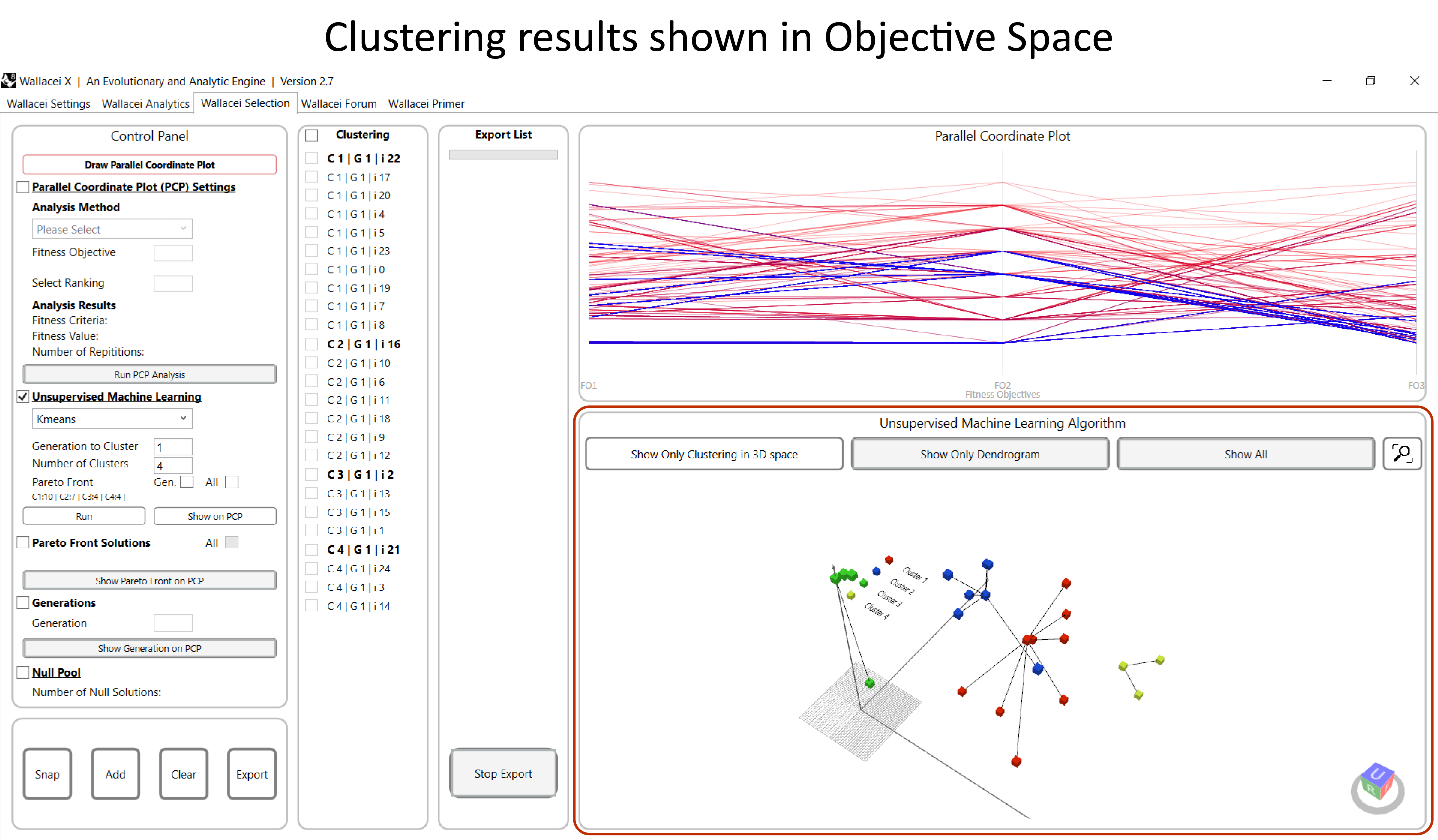
After clicking on run the results of the clustering will show in the Wallacei Selection tab. In the right bottom you will visually see the clustering in the objective space plot.
Analysing clustering results
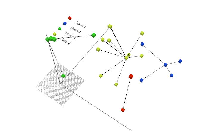
Each cluster is represented by its own colour. Investigate the clustering in the Objective Space, it is important to check if the clusters are made logically. If you click on ‘Run’ again in the Control Pane, the clustering algorithm will create new clusters.
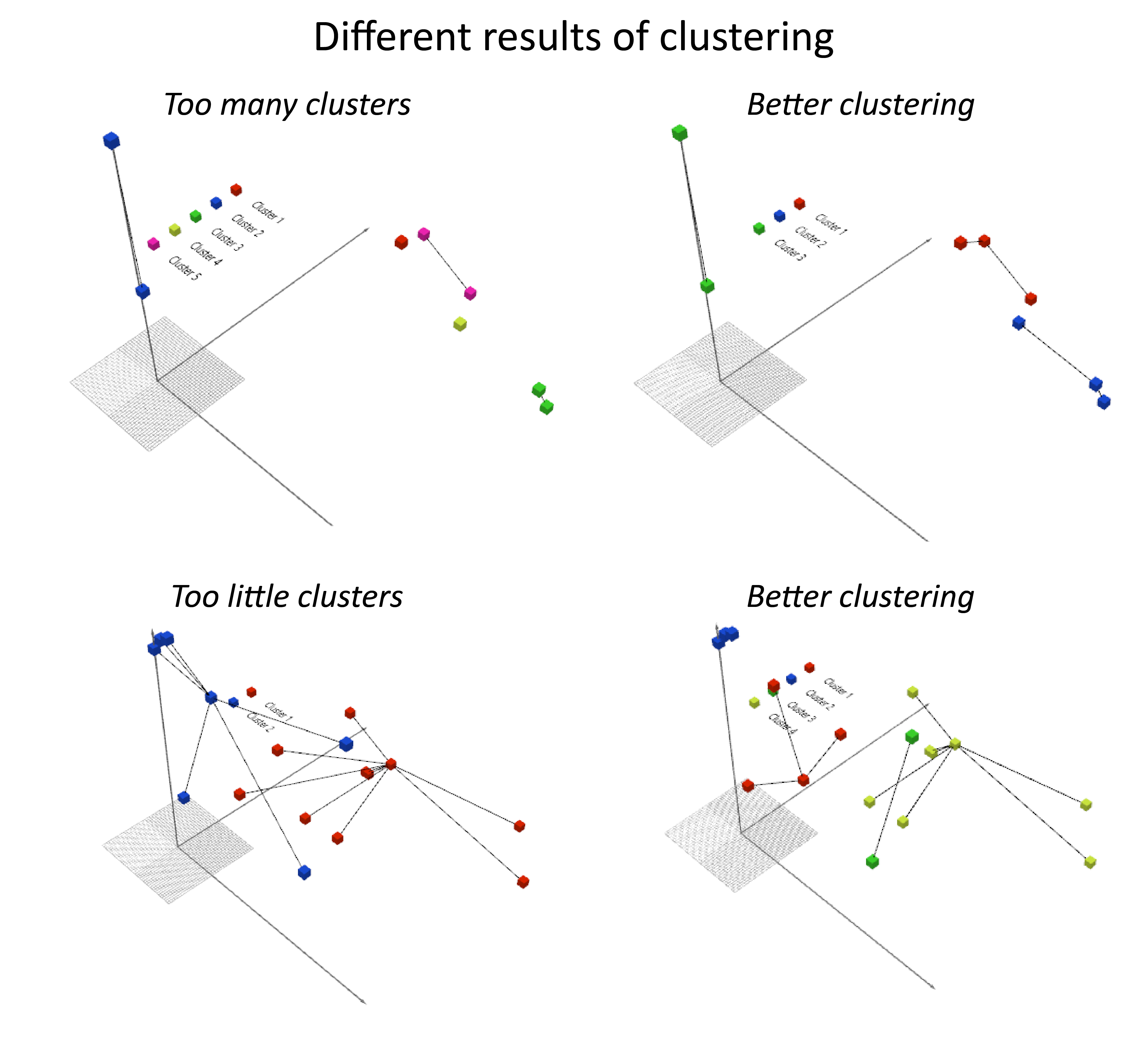
The number of clusters you want to create highly influences the outcome of the clustering. You will have to look critically to the results to see if the number of clusters is relevant for the problem at hand. For example, too many clusters for too little solutions will simply cluster duplicate solutions together. While too little clusters could result in similar solutions being grouped in different clusters and adjective solutions being grouped in the same cluster
Cluster centres
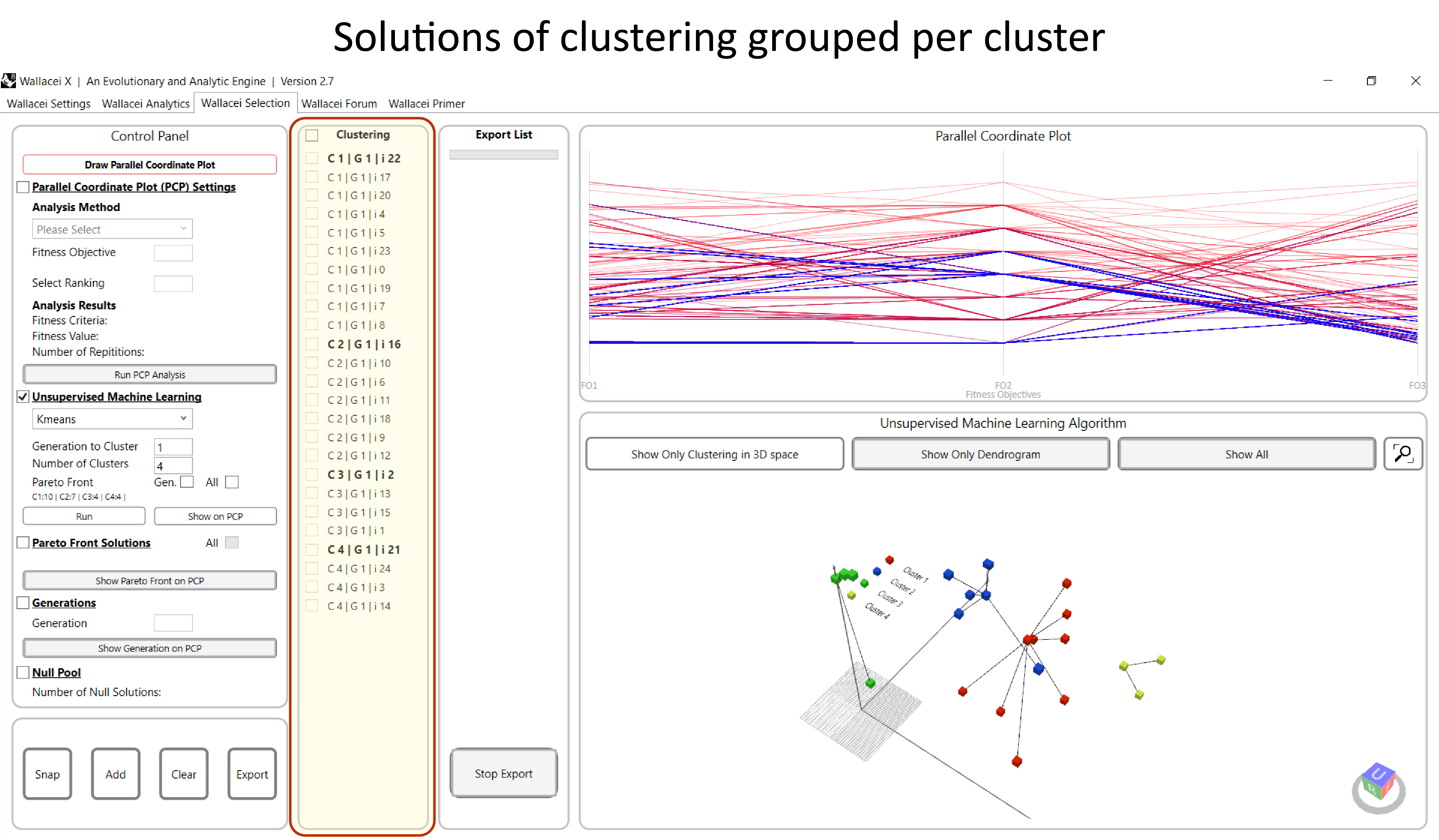
In the second window from the left, you will find all the solutions of the generation grouped per cluster.
You see that certain solutions are highlighted bold. These bold solutions are the centre of the cluster. This solution represents the cluster.
If you want to compare clusters, it is worth investigating the centres of each cluster. You can add those centres to the export list.
Clustering results on PCP

You can also visualize the results of the clustering on the Parallel Coordinates Plot (PCP). In the Control Panel click on ‘Show on PCP’.
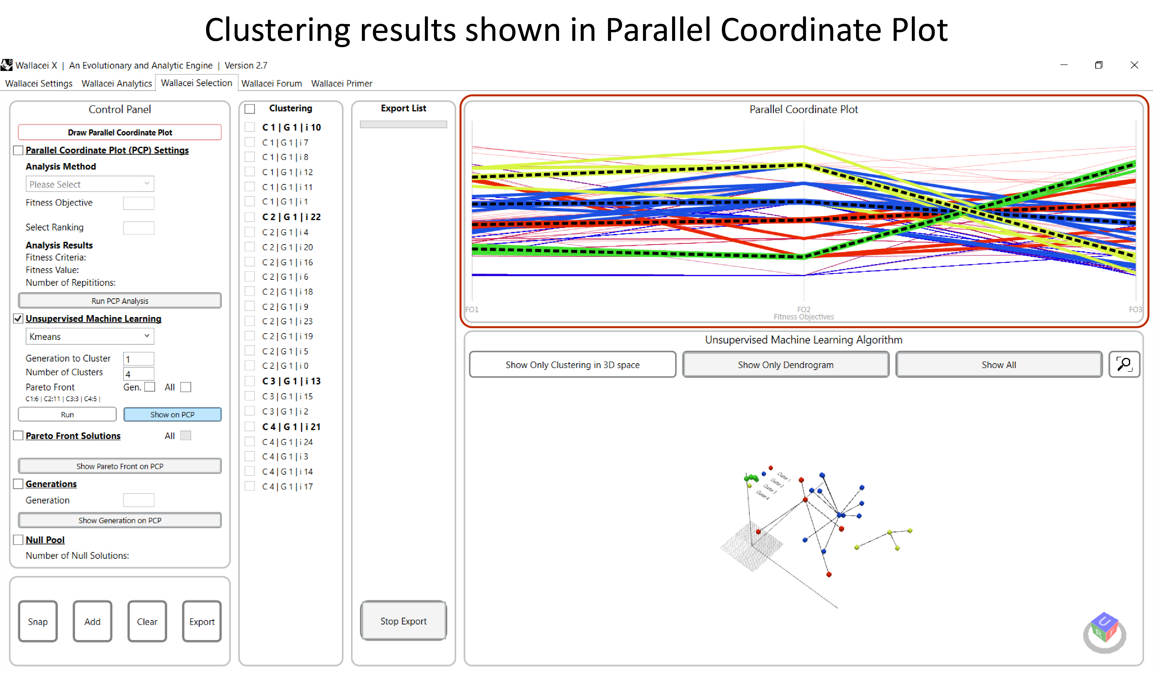
The results of the clustering will appear on the Parallel Coordinate Plot in the top right window. Each cluster is represented by its own colour and the centre of the cluster is highlighted with a bold dotted line.
Wallacei Basics – Analysing and selecting MO-optimization results in Wallacei X 6/8
Exporting Solutionslink copied
The last step in the Wallacei X component is to add solutions to the export list and export the phenotypes. In this chapter, we will walk through these steps.
Adding solutions to export list
In the Wallacei Selection tab there is a solutions window and an export list. To add solutions to the export list you have to check the solutions you want to select in the second window and click on ‘Add’ on the left bottom. The selected individual(s) will now appear in your export list.
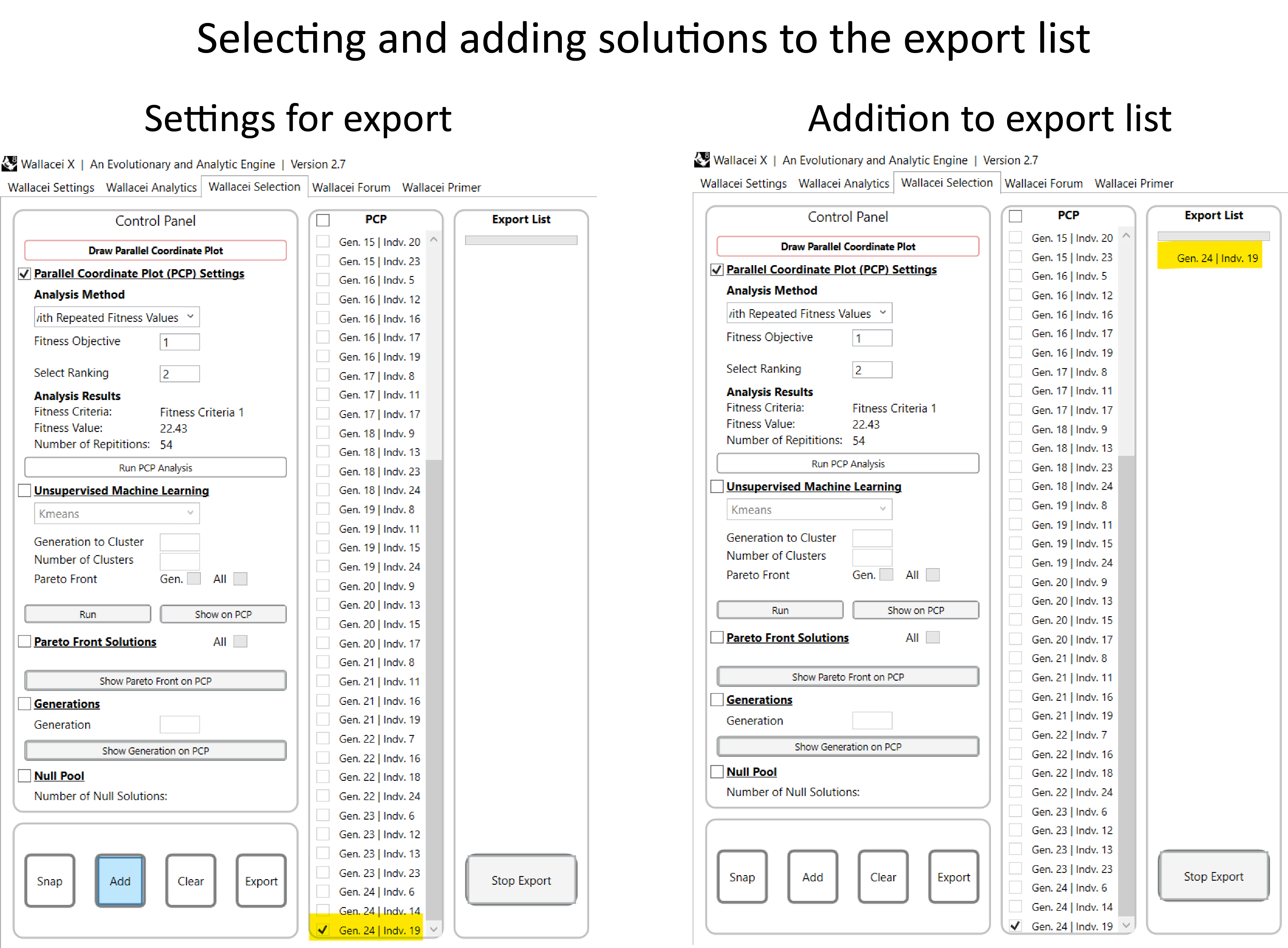
Exporting solutions
Once you have the Export List ready, it’s time to make further progress. You are going to export the phenotypes (solutions that you chose) to be further manipulated inside grasshopper.
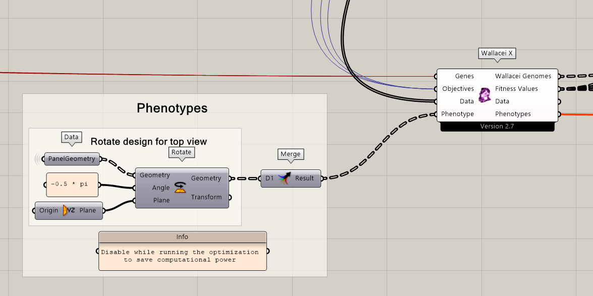
First make sure that the components holding geometry you want to export are plugged into the WallaceiX component. Minimize the Wallacei X tab and check if you have geometries and data connected to the ‘Phenotype’ input and the components are enabled.
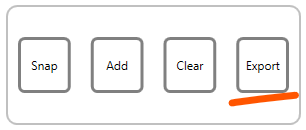
The next step is to export the solutions in the Wallacei X interface. In the WallaceiX interface, go to the Selection Tab, click on the “Export” button.

The export will start loading now. A pop-up will show stating the number of exports. Click on ‘OK’ to start the export.

The time the export takes depends on how many solutions you selected and the geometry that you want to export. In the export list you can see the progress of the export.

Once the export is finished a new pop-up will show, stating the export is finished. You are now done in Wallacei X. Click on ‘OK’ and close Wallacei X.

Now, go back to the grasshopper canvas interface. You can plug in a panel to the “Phenotypes” output to see what’s inside. As you can see, the data is stored as a “Wallacei Phenotype”
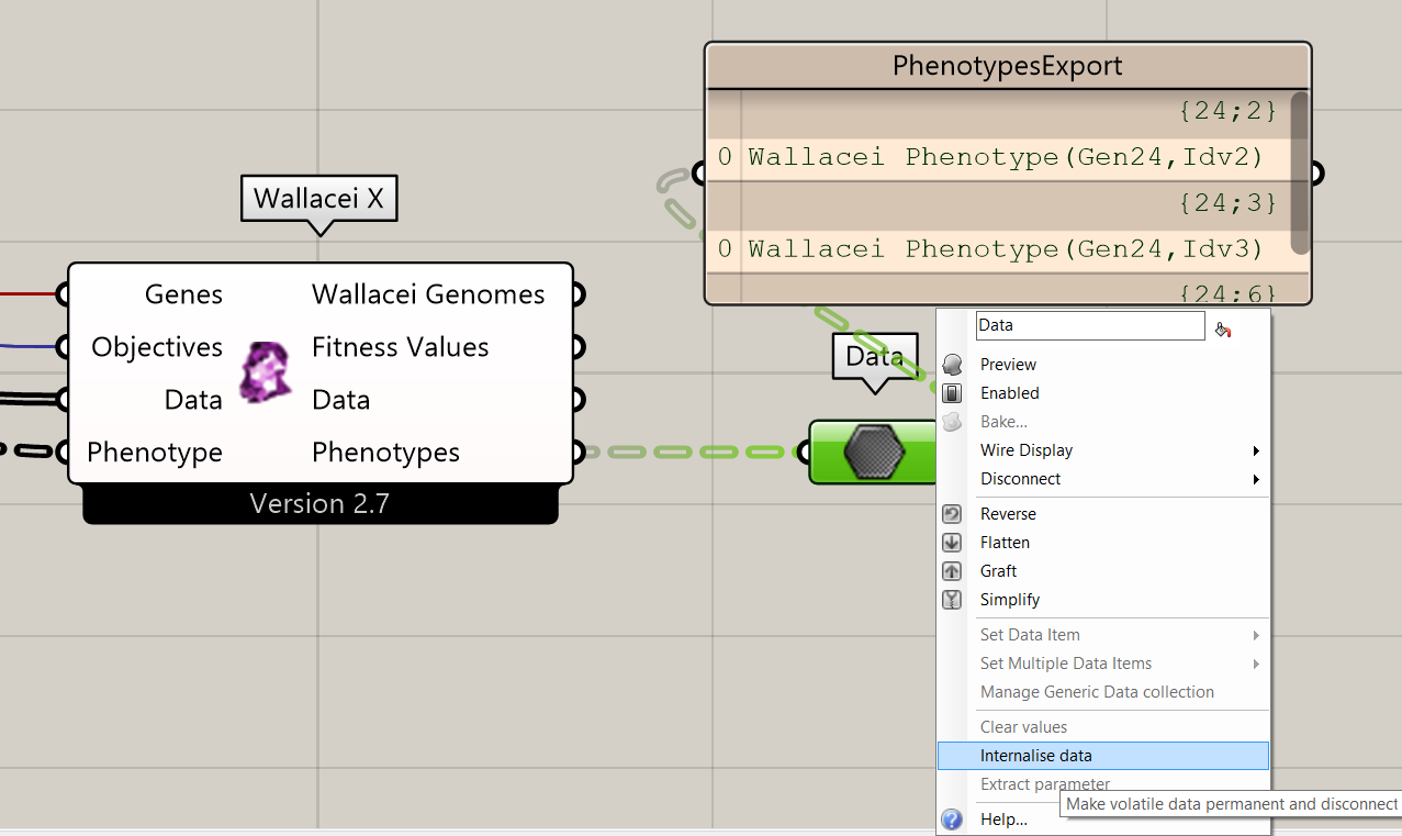
To save the exported phenotypes, create a ‘data’ component and internalize the data. Next save your Grasshopper file to save all the progress.
You can now safely close the Grasshopper script before moving on the next steps. The visualization of phenotypes is explained in the next tutorial.
Wallacei Basics – Analysing and selecting MO-optimization results in Wallacei X 7/8
Conclusionlink copied
In this tutorial, you’ve learned how to analyze the results of a Wallacei multi-objective simulation run in Wallacei X. You now have the skills to make informed decisions about which individuals to export for further visualization and final decision-making. With a solid understanding of the graphs and what they represent in Wallacei analytics, you can dive into data analysis using three exciting methods: clustering with unsupervised machine learning, exploring Pareto Front solutions, and utilizing the Parallel Coordinate Plot.
Now, you’re ready to visualize and export your results confidently, making the most of what you’ve learned about multi-objective optimization!
Wallacei Basics – Analysing and selecting MO-optimization results in Wallacei X 8/8
Useful Linkslink copied
Linked tutorials
The Wallacei Basics – Set-up and run tutorial explains how to prepare you Grasshopper script before running the multi-objective optimization and how to run a multi-objective optimization algorithm in Wallacei X.
Follow up tutorials
The next step in the process is to visualize and process the phenotypes, you can learn this in the ‘Wallacei basics – Visualize’ tutorial. If you want to put the same analysis in practice you can follow the tutorial ‘MO Façade Panelization Optimization – Analyse and Select’.
If you want to learn how to analyse the optimization results in Grasshopper you can follow the tutorial ‘Wallacei basics – Analyse results in Grasshopper’. You can also learn how to analyse the results more interactive with Design builder in tutorial ‘MO analytics with Design Builder’.
Other useful links
Write your feedback.
Write your feedback on "Wallacei Basics – Analysing and selecting MO-optimization results in Wallacei X"".
If you're providing a specific feedback to a part of the chapter, mention which part (text, image, or video) that you have specific feedback for."Thank your for your feedback.
Your feedback has been submitted successfully and is now awaiting review. We appreciate your input and will ensure it aligns with our guidelines before it’s published.
