Self-Organizing Maps
-
Intro
-
Overview
-
Training a Model
-
Training Process
-
Conclusions
Information
| Primary software used | Jupyter Notebook |
| Course | Self-Organizing Maps |
| Primary subject | AI & ML |
| Secondary subject | Machine Learning |
| Level | Intermediate |
| Last updated | November 27, 2024 |
| Keywords |
Responsible
| Teachers | |
| Faculty |
Self-Organizing Maps 0/4
Self-Organizing Maps
Self-Organizing Maps (SOMs) are a type of artificial neural network used for unsupervised learning, where they map high-dimensional data onto a lower-dimensional grid while preserving the topological relationships between data points. This grid, often two-dimensional, visually represents clusters and patterns in the data, making SOMs useful for tasks such as data visualization and dimensionality reduction.
For this tutorial you need to have installed Python, Jupyter notebooks, and some common libraries including Scikit Learn. Please see the following tutorial for more information.
Download the Jupyter notebook here to follow along with the tutorial.
Self-Organizing Maps 1/4
Overviewlink copied
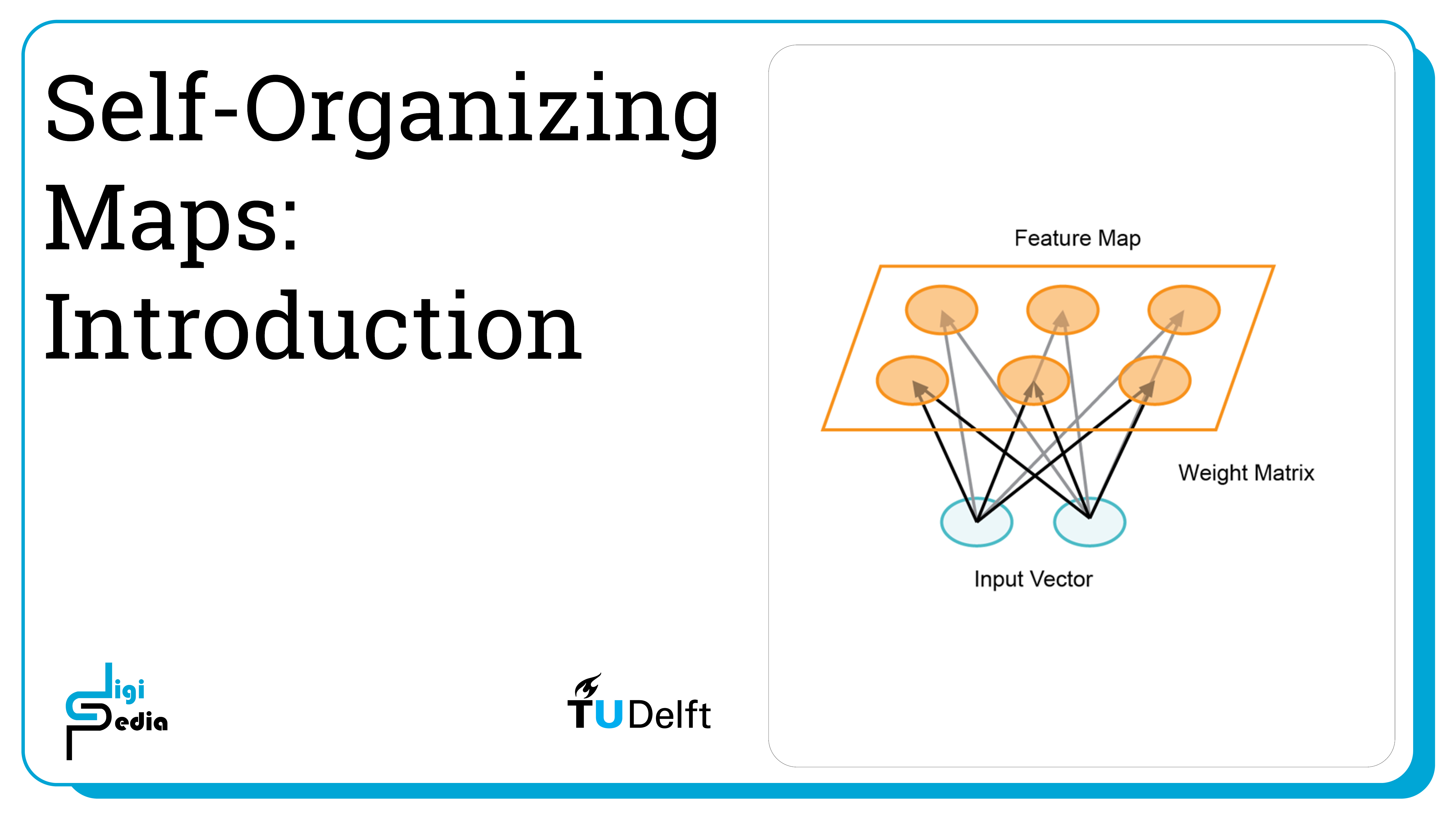
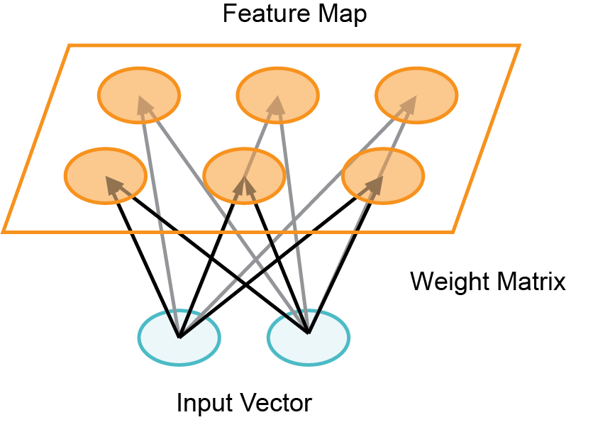
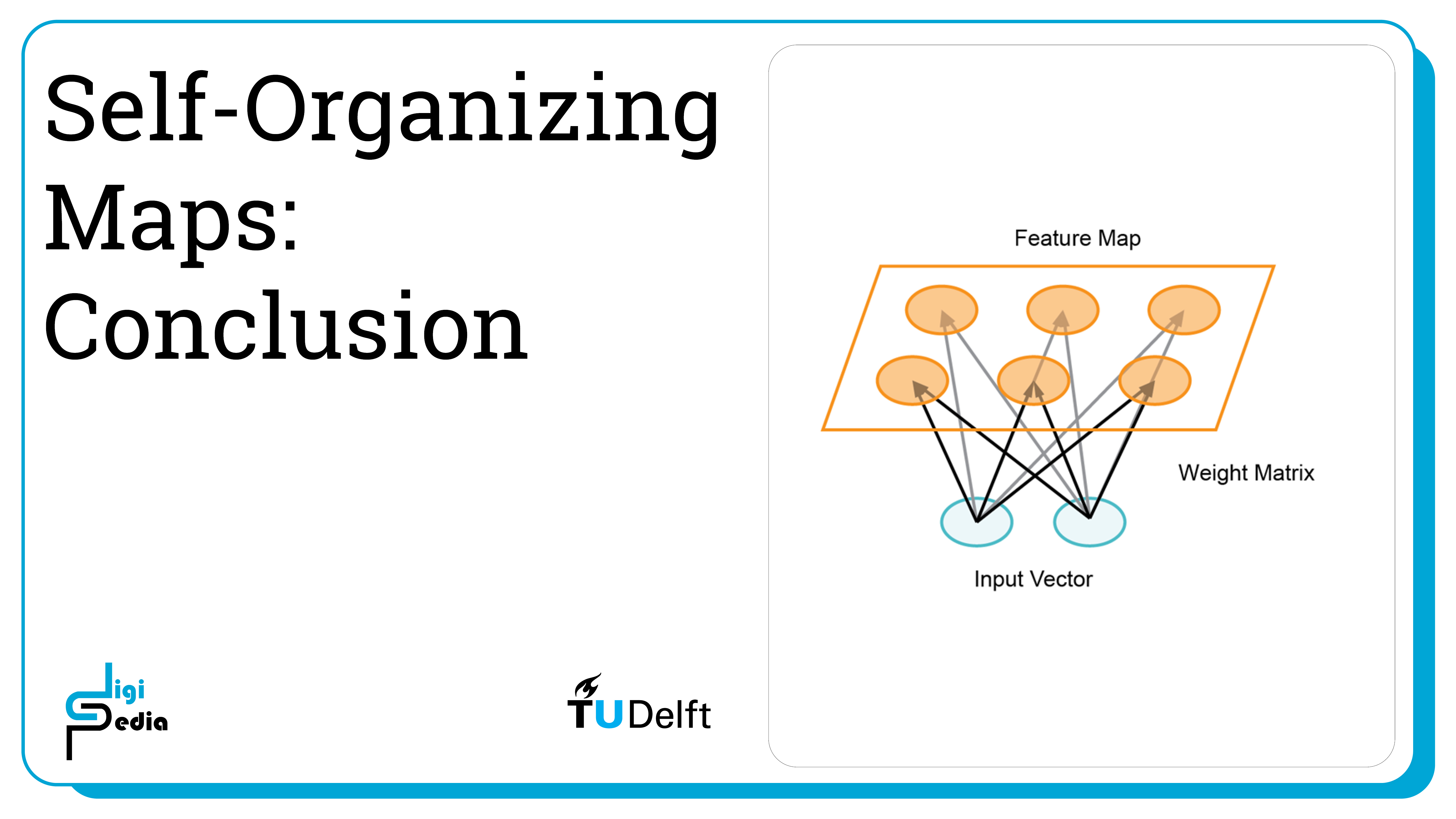
A Self Organizing Map (SOM) is a technique used for machine learning that produces a two-dimensional representation of a higher dimensional data set. The goals is to projects the data set into a lower dimension while preserving the original data structure. The data set is separated into clusters of variables with similar values which can be visualized in a map. In this way, the clusters that are near each other have more similar values than the clusters that are far away. This process makes high-dimensional data easier to visualize and also easier to analyse. A SOM is a type of artificial neural network but instead of learning from error-correction learning like backpropagation with gradient decent, it trains by using competitive learning.
There are many different applications of self-organizing maps but in this notebook we will focus on one that addresses the classification problem using the wine dataset we have used previously. The code found in this notebook is a derivative of the notebook from Minisom: https://github.com/JustGlowing/minisom/blob/master/examples/BasicUsage.ipynb used in accordance to its MIT License.
Self-Organizing Maps 2/4
Training a Modellink copied
Minisom installation
This notebook uses minisom instead of Scikit Learn because Scikit does not implement self organizing maps. It is therefore necessary to install minisom. To do this, run the cell below. After running the cell, you may need to go to Kernel > Restart in the menu bar above to run the rest of the notebook.
pip install minisomDataset
Load the wine data set.
from sklearn.datasets import load_wine
from sklearn.preprocessing import MinMaxScaler
from minisom import MiniSom
import matplotlib.pyplot as plt

# Load the wine dataset
data = load_wine()
X = data.data
target = data.target
label_names = data.target_names
Scale the data.
# Scale the data
scaler = MinMaxScaler()
X = scaler.fit_transform(X)
Initialize and Train SOM
Initialize the SOM and train it. The quantization error measures the quality of the learning and is equal to the average difference of the input samples compared to its corresponding winning neurons. A lower value is better.
# Initialization and training
n_neurons = 9
m_neurons = 9
som = MiniSom(n_neurons, m_neurons, X.shape[1], sigma=1.5, learning_rate=.5,
              neighborhood_function='gaussian', random_seed=0)

som.pca_weights_init(X)
som.train(X, 1000, verbose=True)  # random training
Visualizing the results
There is a number of different visualizations that are helpful for understanding the result of our trained classifier.
Distance Map
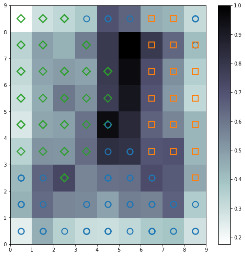
The distance map, also called a U-Matrix, displays the results of the training as an array of cells. The color of each cell represents the distance from that neuron to the neighbor neuron. The symbols on top of the cell represent the samples that are mapped to that specific cell.
import matplotlib.pyplot as plt
%matplotlib inline

plt.figure(figsize=(9, 9))

plt.pcolor(som.distance_map().T, cmap='bone_r')  # plotting the distance map as background
plt.colorbar()

# Plotting the response for each pattern in the wine dataset
# different colors and markers for each label
markers = ['o', 's', 'D']
colors = ['C0', 'C1', 'C2']
for cnt, xx in enumerate(X):
    w = som.winner(xx)  # getting the winner
    # palce a marker on the winning position for the sample xx
    plt.plot(w[0]+.5, w[1]+.5, markers[target[cnt]-1], markerfacecolor='None',
             markeredgecolor=colors[target[cnt]-1], markersize=12, markeredgewidth=2)

plt.show()
Seeds Map
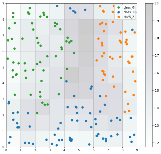
The seeds map is a visualization of how the samples are distributed across the map. The seeds map uses a scatter chart and each dot represents the coordinates of the winning neuron. Where multiple points are located in the same cell, the coordinate is offset by a random distance to avoid overlap.
import numpy as np

w_x, w_y = zip(*[som.winner(d) for d in X])
w_x = np.array(w_x)
w_y = np.array(w_y)

plt.figure(figsize=(10, 9))
plt.pcolor(som.distance_map().T, cmap='bone_r', alpha=.2)
plt.colorbar()

for c in np.unique(target):
    idx_target = target==c
    plt.scatter(w_x[idx_target]+.5+(np.random.rand(np.sum(idx_target))-.5)*.8,
                w_y[idx_target]+.5+(np.random.rand(np.sum(idx_target))-.5)*.8,
                s=50, c=colors[c-1], label=label_names[c])
plt.legend(loc='upper right')
plt.grid()
plt.show()
Neuron Activation
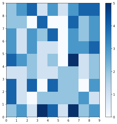
The plot below shows which neurons are activated the most by coding the number of times each neuron is activated (0 through 5 times) as a color to the location of each neuron.
plt.figure(figsize=(7, 7))
frequencies = som.activation_response(X)
plt.pcolor(frequencies.T, cmap='Blues')
plt.colorbar()
plt.show()
Class Assignment
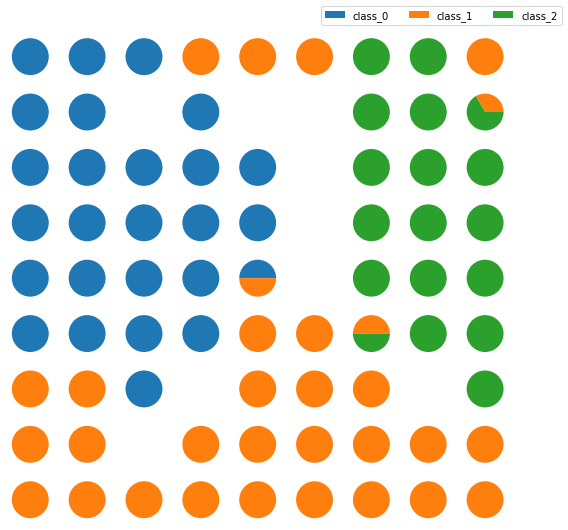
The Class Assignment can be visualized when SOMs are applied to a supervised learning problem. The proportion of samples per class that fall in a specific neuron are visualized using a pie chart for each neuron.
import matplotlib.gridspec as gridspec

labels_map = som.labels_map(X, [label_names[t] for t in target])

fig = plt.figure(figsize=(9, 9))
the_grid = gridspec.GridSpec(n_neurons, m_neurons, fig)
for position in labels_map.keys():
    label_fracs = [labels_map[position][l] for l in label_names]
    plt.subplot(the_grid[n_neurons-1-position[1],
                         position[0]], aspect=1)
    patches, texts = plt.pie(label_fracs)

plt.legend(patches, label_names, bbox_to_anchor=(3.5, 6.5), ncol=3)
plt.show()Self-Organizing Maps 3/4
Training Processlink copied
As discussed in previous notebooks, when training a classifier, it is important to understand how the training progresses. For SOMs, it is possible to plot the quantization and the topographic error of the SOM for each step. This will then show how many iterations should be run to get the trained model. The quantization error measures the quality of the learning and is equal to the average difference of the input samples compared to its corresponding winning neurons. The topographical error measures the projection quality and assesses the number of the data samples having the first best matching unit and the second best matching unit that are not adjacent. For both values, the lower the value, the better.
som = MiniSom(10, 20, X.shape[1], sigma=3., learning_rate=.7,
              neighborhood_function='gaussian', random_seed=10)

max_iter = 1000
q_error = []
t_error = []

for i in range(max_iter):
    rand_i = np.random.randint(len(X))
    som.update(X[rand_i], som.winner(X[rand_i]), i, max_iter)
    q_error.append(som.quantization_error(X))
    t_error.append(som.topographic_error(X))

plt.plot(np.arange(max_iter), q_error, label='quantization error')
plt.plot(np.arange(max_iter), t_error, label='topographic error')
plt.ylabel('error')
plt.xlabel('iteration index')
plt.legend()
plt.show()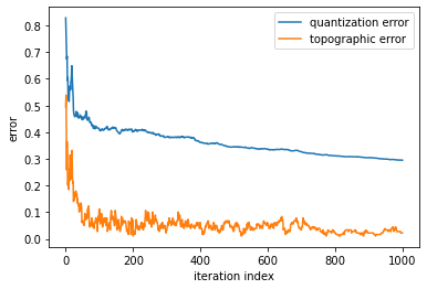
Self-Organizing Maps 4/4
Conclusionslink copied
- A Self Organizing Map is a type of artificial neural network but instead of learning from error-correction learning like backpropagation with gradient decent, it trains by using competitive learning
- The model produces a two-dimensional representation of a higher dimensional data set while preserving the data structure
- The data set is separated into clusters of variables with similar values which can be visualized in a map
- This projection allows variables with similar values to be clustered together
- Self organizing maps make higher-dimensional data easier to visualize and analyse
- To understand how training progresses, plot the quantization and the topographic error for each step
- The quantization error measures the quality of the learning and is equal to the average difference of the input samples compared to its corresponding winning neurons
- The topographical error measures the projection quality and assesses the number of the data samples having the first best matching unit and the second best matching unit that are not adjacent
Write your feedback.
Write your feedback on "Self-Organizing Maps"".
If you're providing a specific feedback to a part of the chapter, mention which part (text, image, or video) that you have specific feedback for."Thank your for your feedback.
Your feedback has been submitted successfully and is now awaiting review. We appreciate your input and will ensure it aligns with our guidelines before it’s published.
