Analyzing a Building Plan in Graph Structure
-
Intro
-
The Data Format for Gephi
-
Graph Analysis in Gephi
-
Graph Visualization in Gephi
Information
| Primary software used | Gephi |
| Software version | 1.0 |
| Course | Analyzing a Building Plan in Graph Structure |
| Primary subject | Analysis & simulation |
| Secondary subject | Network Analysis |
| Level | Beginner |
| Last updated | June 10, 2025 |
| Keywords |
Analyzing a Building Plan in Graph Structure 0/3
Analyzing a Building Plan in Graph Structure
With this tutorial you will learn how to analyse a building plan that has been transformed into a graph structure. This tutorial is based on a reader for the course AR0108 Mastermind available here.
Nourian, P., & Bai, N. (2021). Reuse: On Evaluating the Fitness of Spatial Configurations Before & After Retrofitting for Reuse of Architectural Heritage. In A. Pereira Roders (Ed.), Mastermind CRASH: A method to reveal the impact of architectural redesign (pp. 23-72). TU Delft OPEN Publishing.
Analyzing a Building Plan in Graph Structure 1/3
The Data Format for Gephilink copied
As is discussed in other tutorials, there are various ways to represent a network/graph, it is also the case for Gephi. We suggest you to use the Node List (Table) + Edge List (Table) representation.
In order to make your importing correct, make sure to do the following steps in your excel sheet before move on to Gephi:
- With your Node Table, make sure the columns ID, Function Type, Function Name are complete.
- With your Link Table, make sure to have two columns “Source” and “Target” with the IDs of the nodes, which are the requirement of Gephi.
See also Transforming the plans manually:
Analyzing a Building Plan in Graph Structure 2/3
Graph Analysis in Gephilink copied
This tutorial is based on Gephi 0.9.2. For other versions the user interface might be slightly different, but the functionality should be similar.
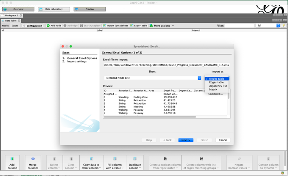
Click on “Import Spreadsheet” in Data Laboratory panel and select your weekly progress excel file.
Select “Detailed Node List” sheet and import as “Node table”. Keep everything as default and finish importing the nodes.
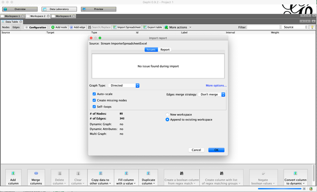
Do the first step again. This time select “Link List” sheet and import as “Edges table”. Keep everything as default except for select “Append to existing workspace” in the last window. Keep the graph type as “Directed” to avoid error, we are able to do analysis as if it is undirected later on.

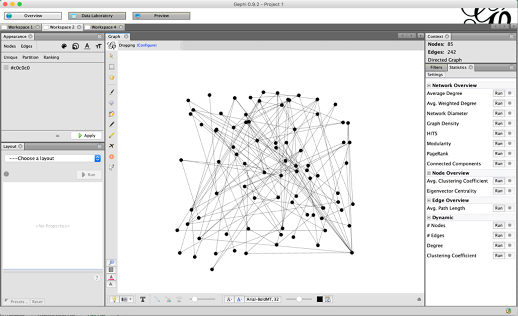
Now in Overview panel you will be able to see the initial state of your first graph.
Click the “Run” button for “Average Degree”, “Network Diameter”, “Eigenvector Centrality” on you right and let Gephi compute all the centrality values for you.
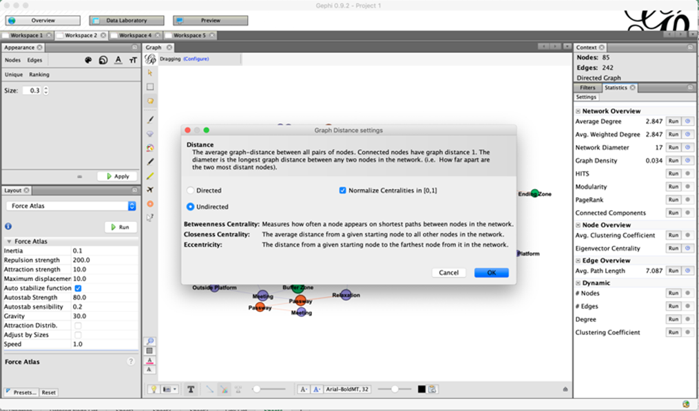
When computing the “Network Diameter”, select “Undirected” and “Normalize Centralities in [0,1]”. When computing the “Eigenvector Centrality”, select “Undirected”.
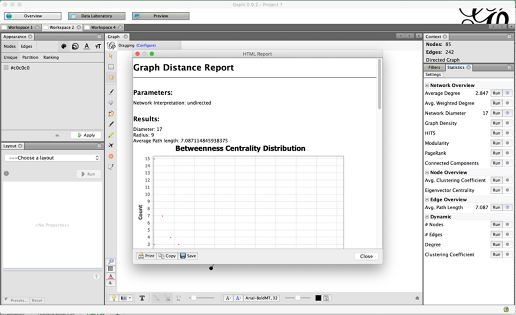
Save some of the pop-up report if you like. You may want to add them into your presentation. Record the “Average Path Length” value if you choose to make your assessment on Accessibility based on that.
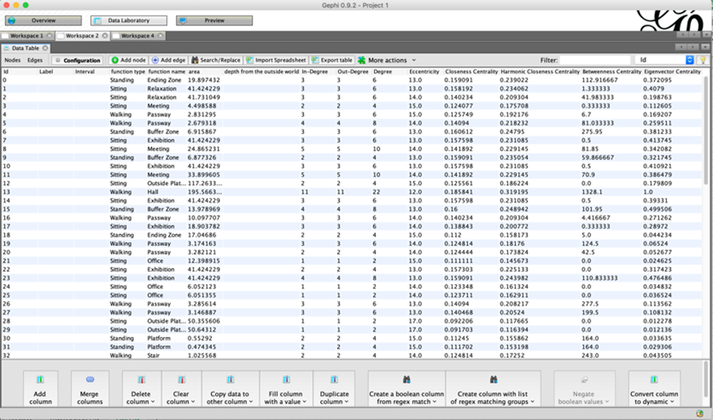
Go back to the Data Laboratory panel, and you will see that now you have all the required centrality values (Degree Centrality is here replaced with Degree).
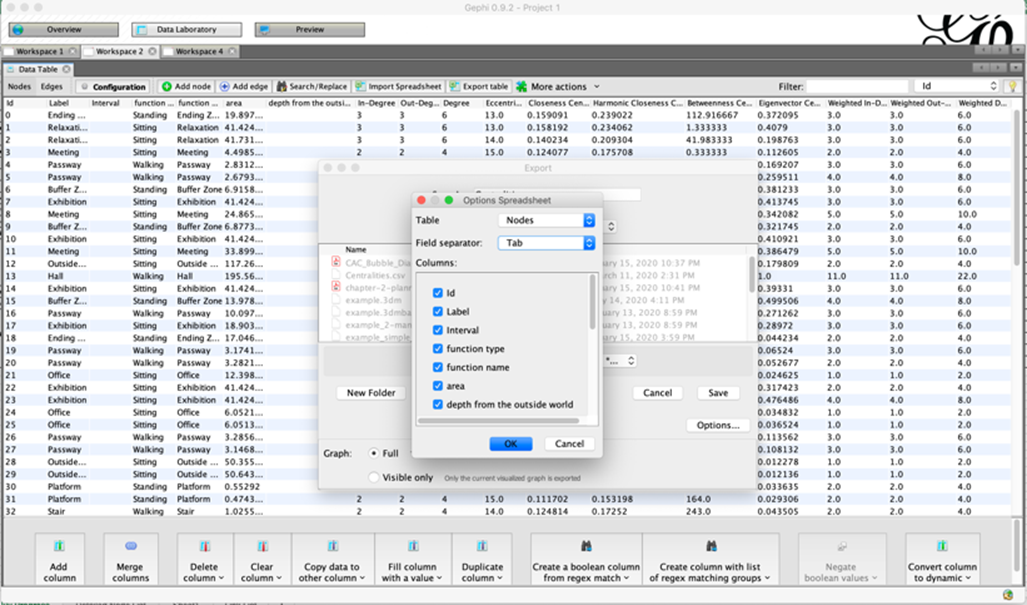
Click on “Export table” and click on “Options…” button. Make sure you choose the Table “Nodes” and Field Separator “Tab”.
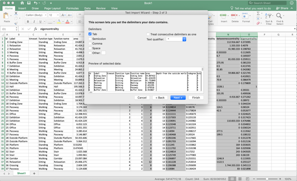
You can now import this csv file in excel using “Tab” as Delimiters. Then you can copy-paste the four columns of required centrality values into your excel sheet.
Gephi exports the csv file with the standard of decimal points rather than decimal comma (see this link for more information), which means that the numbers may be recognized incorrectly in your excel. Keep this in mind and check what the occasion is for you. You may want to replace all the decimal separator to fit your own computer.
Analyzing a Building Plan in Graph Structure 3/3
Graph Visualization in Gephilink copied
You can also play around with the visualization tools on the left in Overview panel. Here are some suggestions what you can do to explore.
Change the size of nodes by the ranking of any of the centrality values.
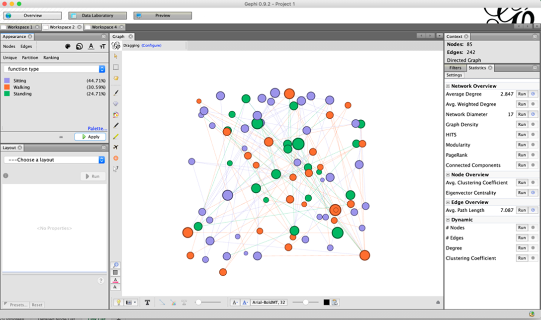
Change the colour of nodes by the partition of different function type or function name (or anything that interests you).
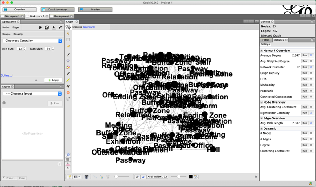
Copy the function name column into label in the Data Laboratory panel and turn on the labels for each node in Overview panel and set the label size in a reasonable range.
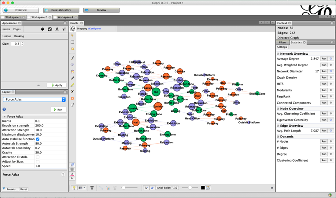
Try different layout tools to see what happens. If your labels overlap annoyingly, use “Label Adjust” can be helpful.
Figure out by yourself what can be a good presentation and visualization for the information that you would like to transfer.
Write your feedback.
Write your feedback on "Analyzing a Building Plan in Graph Structure"".
If you're providing a specific feedback to a part of the chapter, mention which part (text, image, or video) that you have specific feedback for."Thank your for your feedback.
Your feedback has been submitted successfully and is now awaiting review. We appreciate your input and will ensure it aligns with our guidelines before it’s published.