Clustering Of N-D Data with WoON Dataset
-
Intro
-
Libraries and Dataset
-
Data Preprocessing
-
Run K-Means Clustering
-
Cluster Evaluation
-
Conclusion
Information
| Primary software used | Python |
| Software version | 1.0 |
| Course | Clustering Of N-D Data with WoON Dataset |
| Primary subject | AI & ML |
| Secondary subject | Machine Learning |
| Level | Intermediate |
| Last updated | November 12, 2025 |
| Keywords |
Responsible
| Teachers | |
| Faculty |
Clustering Of N-D Data with WoON Dataset 0/5
Clustering Of N-D Data with WoON Dataset
Example of clustering data of the WoON21 dataset.
Clustering points in 2D is intuitive: one can easily recognise different point groups by visually inspecting the data distribution, draw a decision boundary by hand and cluster any new data point by plotting it on the feature space graph and seeing in which cluster it falls.
Conversely, visualising, and comparing data points as well as defining decision boundaries in high-dimensional feature space is not trivial. That’s where K-means clustering becomes more useful.
This tutorial shows how K-means clustering can uncover hidden relationships in the WoON dataset. The tutorial also covers dimensionality reduction techniques for data visualisation.

Exercise file
To discuss and understand data set cleaning, we will use the WoON21 dataset. The dataset consists of data on the composition of households, the housing situation, housing preferences, housing costs and moving behaviour. The survey is conducted every three years by the Dutch government and is an important basis for the housing policy in The Netherlands.
You can download the dataset on the BK3WV4 Brightspace page. If you want to know more about the WoON dataset you can visit the dashboard of Woononderzoek Nederland. You can also download your own selection of the dataset at the Citavista Databank in case you do not have access to the Brightspace.
Additionally, here you can download additional information, such as the explanation of the variables in the WoON2021 dataset in both Dutch and English.
Clustering Of N-D Data with WoON Dataset 1/5
Libraries and Datasetlink copied
Import Libraries
We start by importing the libraries for Machine Learning and data visualisation.
from google.colab import drive
import pandas as pd
import numpy as np
from sklearn.cluster import KMeans
from sklearn.manifold import TSNE
from sklearn.metrics import silhouette_score
from sklearn.preprocessing import StandardScaler
import matplotlib.pyplot as plt
Load Dataset
We import the WoON2021 dataset from our Google Drive folder and construct a pandas dataframe. We use the last line in the following code snippet to print some statistics about the dataframe values. Each column represent a feature we may want to select to represent our data points for the classification problem.
# Define the right file path
file_path = '/content/drive/MyDrive/WoON21_dataset.csv'

# construct dataframe object
df_loaded = pd.read_csv(file_path)

#visualise the imported dataset
df_loaded.describe()Clustering Of N-D Data with WoON Dataset 2/5
Data Preprocessinglink copied
We must then select features from the WoON dataset for the clustering problem. This requires stating a research hypothesis.
We hypothesise that, based on the minimum distance to specific amenities, there are different types of living environments in the WoON dataset. These environment typologies could provide insight into housing and neighbourhood dynamics and their relation to accessibility.
Note: we do not know the exact number or characteristics of these house typologies in advance. It is the researcher’s job to interpret the clusters identified by K-means and draw conclusions.
Data Selection
Clustering is an unsupervised learning method, meaning we do not have ‘true’ labels to assess model accuracy. For K-means clustering, we only need to provide an input vector `X` representing our data points.
Following our research hypothesis, we filter our dataset for distance related features. We also include ‘hwmbtr’ as a keyword. This is not necessary for training, but for evaluating the clustering process later.
# Filter the dataframe
df_selection = df_loaded.filter(regex='vzafstand|hwmbrt')
df_selection.columns
Remove null values
We then proceed plotting all the null counts per column. By creating a plot of the null counts, you get insights in which feature contains missing information.
# Count the null values of all the columns and plot the results
null_counts = df_selection.isnull().sum()

# create null count plot per column
plt.figure(figsize=(12, 6))
plt.bar(range(1, len(null_counts) + 1), null_counts.values)

plt.title('Null Values in Each Column')
plt.xlabel('Columns')
plt.ylabel('Number of Null Values')
plt.show()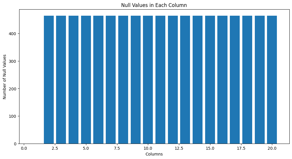
By checking the shape of the dataset before and after the removal of null values, we find out that the number of samples containing information for all selected features is slightly less than the original dataset.
# drop rows with NA values
df_selection_removed = df_selection.dropna()

# print df shape before and after removing NA values
print('dataset shape before data cleaning', df_selection.shape)
print('dataset shape after data cleaning', df_selection_removed.shape)
Output:
dataset shape before data cleaning (20000, 20)
dataset shape after data cleaning (19535, 20)
Normalise Data
Next we normalise the X vector values. We only do this for the input features.
# construct vectors for k-means clustering and cluster evaluation
urbanity_y = df_selection_removed['hwmbrt']
X = df_selection_removed.drop(columns=['hwmbrt'])

# normalise data
scaler = StandardScaler()
X_scaled = scaler.fit_transform(X)
Note: in the classification with Decision Tree tutorials, we did not standardize the data because Decision Trees do not require features to be on comparable scales. The algorithm splits the feature space based on individual feature thresholds, one feature at a time. Conversely, K-means clustering is sensitive to the scale of the data. Therefore, standardizing the dataset in this case ensures that each feature contributes equally to the analysis, leading to more accurate results.
Clustering Of N-D Data with WoON Dataset 3/5
Run K-Means Clusteringlink copied
To determine the optimal number of clusters, we run K-means clustering for different values of `k` and use the Elbow Method. The elbow point indicates where adding more clusters has diminishing returns on reducing inertia (Within-Cluster Sum of Squares).
In this graph, the elbow point appears to be around k = 3.
# compute inertia for different number of clusters
inertia = []
k_values = range(1, 11)

for k in k_values:
    kmeans = KMeans(n_clusters=k, random_state=42)
    kmeans.fit(X_scaled)
    inertia.append(kmeans.inertia_)

# Plot the Elbow Method graph
plt.figure(figsize=(8, 5))
plt.plot(k_values, inertia, 'bo-', linewidth=2)
plt.xlabel('Number of Clusters (k)')
plt.ylabel('Within-Cluster Sum of Squares (Inertia)')
plt.title('Elbow Method for Optimal k')
plt.show()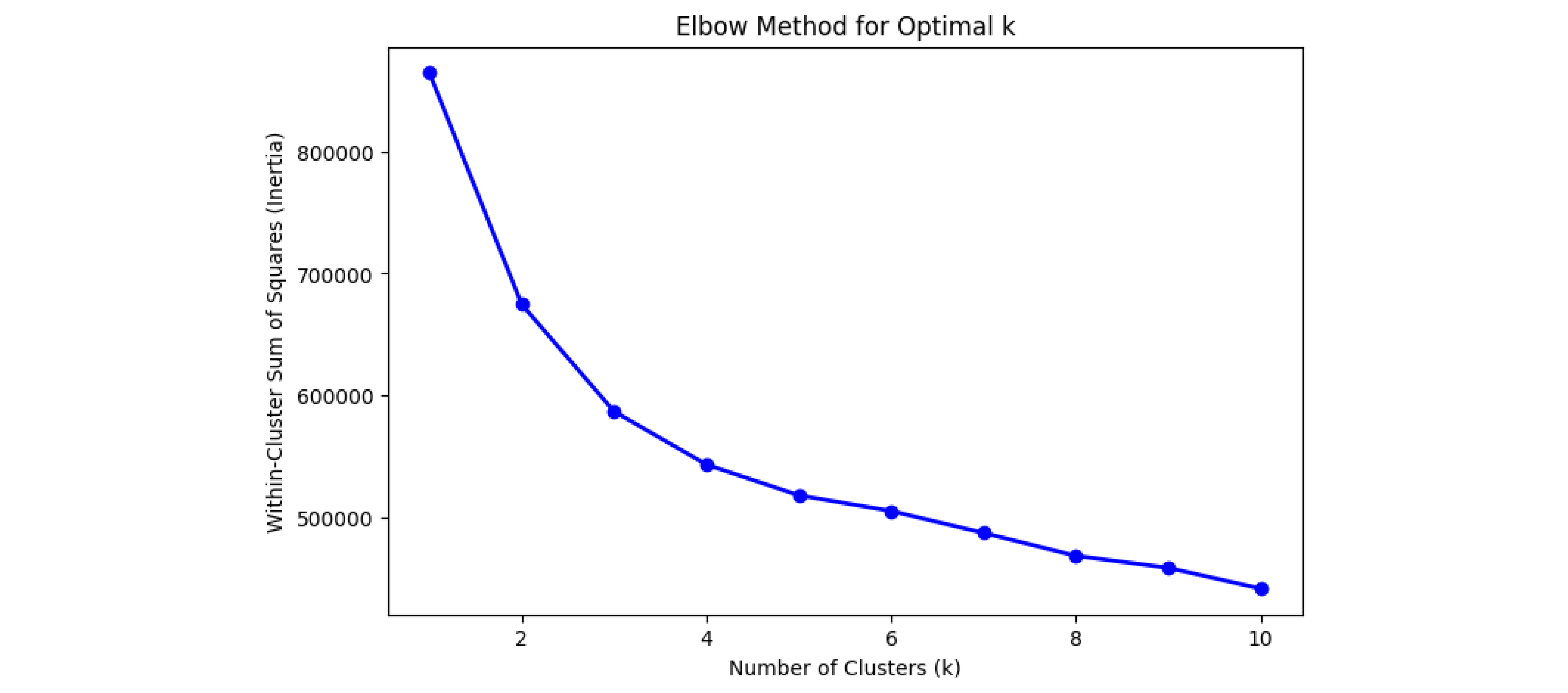
Using the identified `k` value from the Elbow Method, we train K-means and assign cluster IDs to the data samples.
optimal_k = 3
kmeans = KMeans(n_clusters=optimal_k, random_state=42)
y_kmeans = kmeans.fit_predict(X_scaled)Clustering Of N-D Data with WoON Dataset 4/5
Cluster Evaluationlink copied
To validate cluster quality, we use the Silhouette Score, which measures how distinct clusters are.
Interpreting silhouette scores can be challenging. In 2D, we could plot the decision boundary and visually inspect the cluster shape as an additional form of validation. This is not possible for high-dimensional spaces.
silhouette_avg = silhouette_score(X_scaled, y_kmeans)
print(f'Silhouette Score: {silhouette_avg:.2f}')
Output:
Silhouette Score: 0.25
Dimensionality Reduction and Visualisation
To visualise the clusters, we need a dedicated Machine Learning method for dimensionality reduction. Here we use t-SNE, a method that allows projecting high dimensional data onto a 2D plane.
The x and y axes in the graph correspond to t-SNE components capturing the most significant data variations. We colour the points in the graph using the model’s predictions.
Note that running this code snippet will take a few minutes as the dataset contains around 50k samples.
tsne = TSNE(n_components=2, random_state=42)
X_tsne = tsne.fit_transform(X_scaled)

# Plot the t-SNE projection colored by K-means cluster labels
plt.figure(figsize=(8, 6))
plt.scatter(X_tsne[:, 0], X_tsne[:, 1], c=y_kmeans, cmap='viridis', s=0.5)
plt.title("k-Means Clusters")
plt.xlabel("t-SNE Component 1")
plt.ylabel("t-SNE Component 2")
plt.colorbar(label='Cluster ID')
plt.show()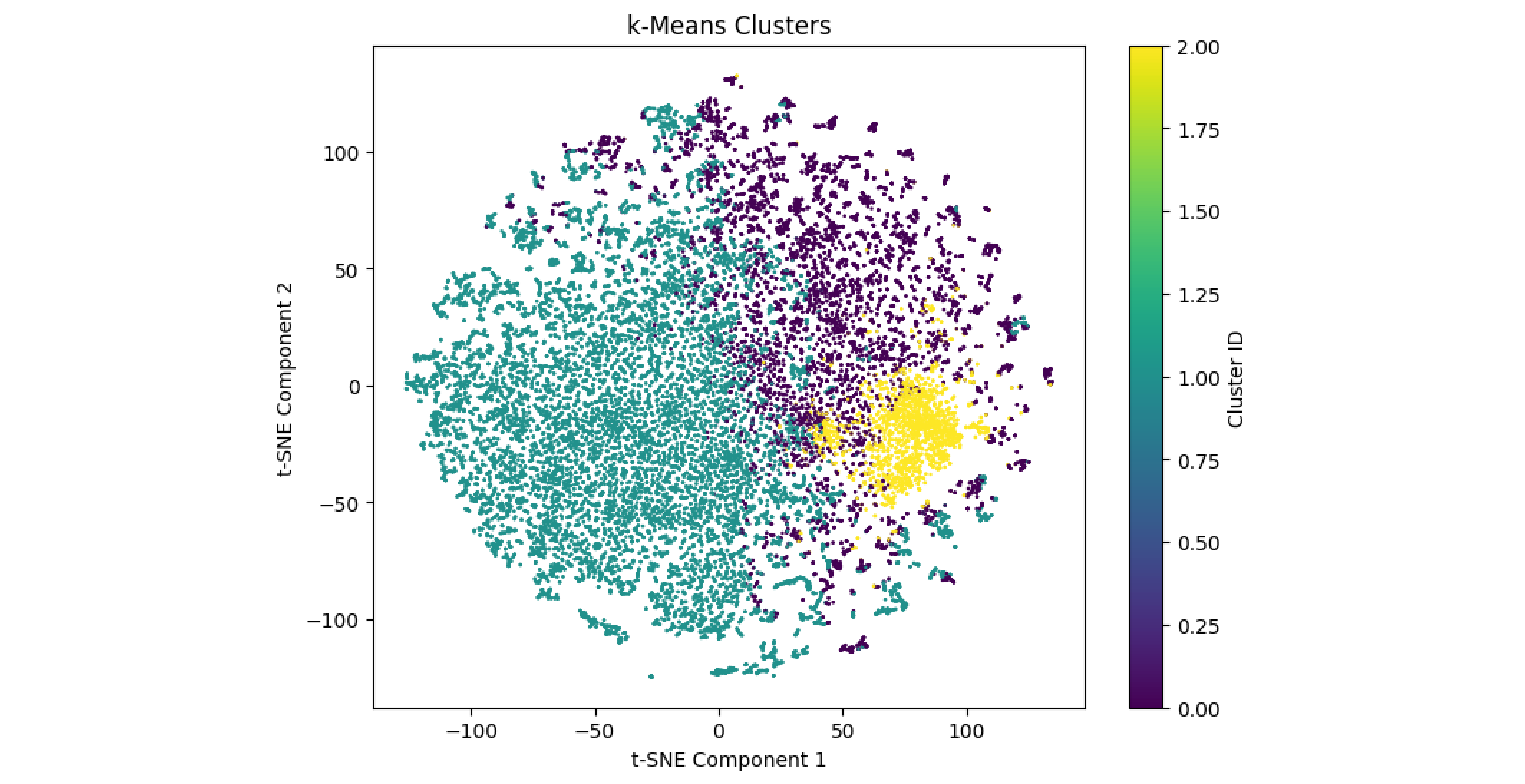
Further Analyses and Comparisons
We compare the clusters learned by the K-means model with the urbanity classification feature ‘hwmbtr’, which categorises residential locations by urbanity level. To do this, we plot the t-SNE projection, assigning each data point a colour corresponding to one of the five classes in ‘hwmbtr’.
In the resulting graph, despite considerable overlap among clusters, distinct regions of density can be observed, particularly for certain urbanity levels. For instance, we observe overlaps between cluster 2 and class 5 as well as cluster 1 and class 4. Cluster 3 instead seems to overlap with classes 1-3, representing lower density areas. These overlaps suggest that the model captured patterns in the data that align with urbanity levels.
plt.figure(figsize=(8, 6))
plt.scatter(X_tsne[:, 0], X_tsne[:, 1], c=urbanity_y, cmap='viridis', s=0.5)
plt.title("Urbanity Level")
plt.xlabel("t-SNE Component 1")
plt.ylabel("t-SNE Component 2")
plt.colorbar(label='Cluster ID')
plt.show()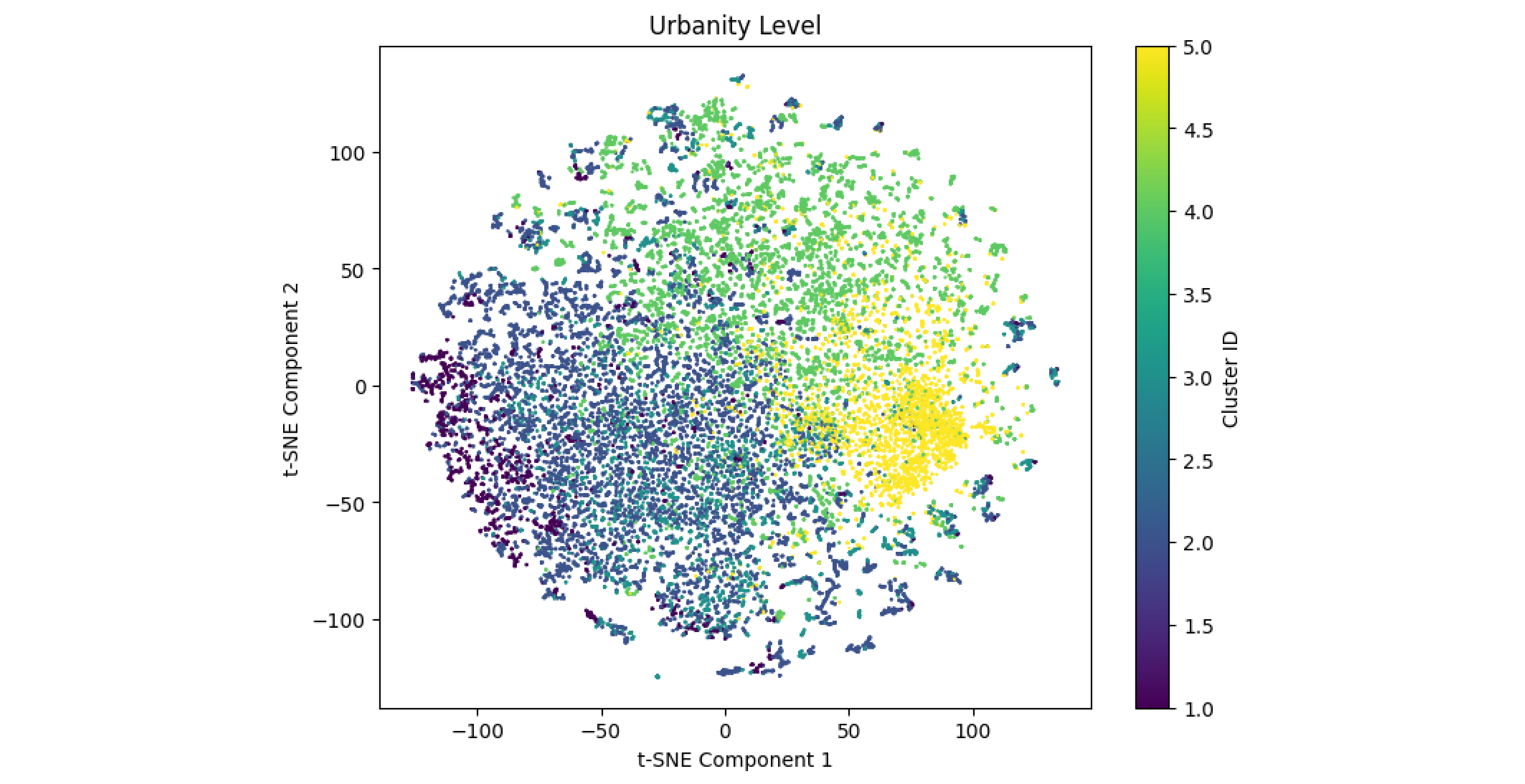
Note: in most cases, clustering results are not straightforward to interpret. Clustering reveals patterns within data but does not assign labels or names to the clusters. It is the researcher’s job to interpret these groupings and investigate their mutual relationship further.
Clustering Of N-D Data with WoON Dataset 5/5
Conclusionlink copied
This tutorial provided an overview of clustering high-dimensional data using K-means. By working with the WoON2021 dataset, you learned how to set up and preprocess data for clustering, select the optimal number of clusters, and evaluate clusters using the Silhouette Score. Additionally, you explored dimensionality reduction with t-SNE to visualize high-dimensional clusters in 2D and compared these clusters using other features in the dataset.
Exercise file
Here you can find the full script of this exercise:
Write your feedback.
Write your feedback on "Clustering Of N-D Data with WoON Dataset"".
If you're providing a specific feedback to a part of the chapter, mention which part (text, image, or video) that you have specific feedback for."Thank your for your feedback.
Your feedback has been submitted successfully and is now awaiting review. We appreciate your input and will ensure it aligns with our guidelines before it’s published.
