Clustering 2D Data
-
Intro
-
Generate Dataset
-
Run K-Means Clustering
-
Visualise the Decision Boundary
-
Hyperparameters Tuning
-
Cluster Evaluation
-
Conclusion
Information
| Primary software used | Python |
| Software version | 1.0 |
| Course | Clustering 2D Data |
| Primary subject | AI & ML |
| Secondary subject | Machine Learning |
| Level | Intermediate |
| Last updated | November 12, 2025 |
| Keywords |
Responsible
| Teachers | |
| Faculty |
Clustering 2D Data 0/6
Clustering 2D Data
This is an example of clustering 2D data.
This tutorial will walk you through using a Machine Learning algorithm called K-means to group data points according to their similarities. This process, named Clustering, is useful when dealing with unlabelled datasets, that is, datasets that lack a predefined target class.
This tutorial demonstrates clustering an artificially generated dataset in 2D. We will explore how the K-means algorithm works, visualise the clusters in the feature space, and uncover the algorithm’s limitations.
After this tutorial, you will understand how to apply the K-means algorithm to group data points in 2D and higher-dimensional feature spaces. You’ll be able to visualise clusters, assess the quality of the clustering process, and use hyperparameter tuning techniques.
Clustering 2D Data 1/6
Generate Datasetlink copied
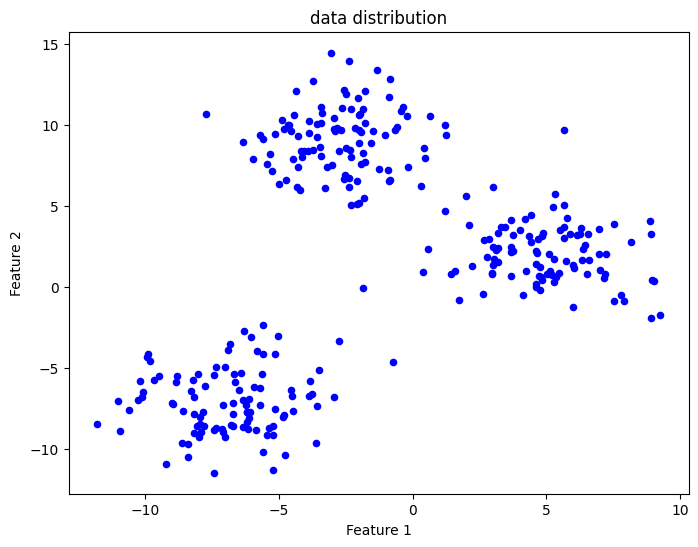
We will use the sklearn library to generate a 2D point distribution. These points represent our input dataset.
We start by importing the libraries for Machine Learning and data visualisation
from sklearn.datasets import make_blobs
from sklearn.cluster import KMeans
from sklearn.metrics import silhouette_score
import numpy as np
import matplotlib.pyplot as plt
We use the sklearn.make_blobs function to produce Gaussian-distributed point clusters. This function asks for the number of centres we want, which means the number of point clusters. Then we must specify cluster_std, the standard deviation, which indicates how much the points are scattered within each cluster. The random_state argument is an integer value controlling the random initialization of the cluster center locations.
# generate Gaussian blobs for clustering
X, _ = make_blobs(n_samples=300, centers=3, cluster_std=2.0, random_state=42)
Visualise the Dataset
We can use a scatter plot to visualise the point distribution we created on a 2D graph.
Try generating different datasets by changing the cluster_std parameter. For higher values, the points will start overlapping, making it harder to visually recognize distinct clusters.

# plot the generated dataset
plt.figure(figsize=(8, 6))
plt.scatter(X[:, 0], X[:, 1], s=20, c='b')
plt.xlabel("Feature 1")
plt.ylabel("Feature 2")
plt.title("data distribution")
plt.show()Clustering 2D Data 2/6
Run K-Means Clusteringlink copied
We will now use the K-Means implementation provided with the sklearn library.
We must make an initial guess about the number of clusters `n_clusters`. Since we have a dataset containing artificially generated point groups following a specific number of Gaussian distributions, we can set `n_clusters` to exactly correspond to the number of point groups.
The `random_state` argument controls where the cluster centroids are located when the algorithm is initialised.
After training K-Means on our data points `X`, we use the predict method to produce a vector `y_kmeans` containing an integer value for each and every point. This value represents the cluster ID for that point.
# apply KMeans clustering
kmeans = KMeans(n_clusters=3, random_state=42)
kmeans.fit(X)
y_kmeans = kmeans.predict(X)
print(y_kmeans)
output = [1 1 0 2 1 2 0 2 0 0 0 2 0 0 1 0 1 2 0 0 0 0 2 1 0 1 1 2 2 0 0 0 1 0 1 0 1
2 1 2 2 0 1 2 0 0 1 2 1 2 2 1 1 0 1 2 1 0 2 0 1 2 2 1 1 2 2 1 1 0 2 1 1 0
0 1 1 2 0 2 0 0 1 0 2 1 1 0 2 0 1 0 1 0 0 1 1 0 1 1 2 0 2 0 0 0 0 0 2 1 2
0 0 0 0 2 1 2 1 2 2 2 0 1 1 1 1 0 1 1 0 0 0 0 0 2 2 1 0 1 0 0 1 0 2 2 2 0
2 0 0 1 2 1 0 2 2 1 1 0 0 1 1 1 0 1 2 0 0 0 0 0 2 0 2 2 2 0 2 2 1 0 1 2 2
1 2 0 2 2 1 1 2 1 2 2 2 2 0 1 0 0 2 2 0 2 1 1 2 0 0 1 2 2 1 1 1 1 0 1 1 2
1 1 0 2 1 1 2 0 0 1 0 1 2 2 1 2 1 1 1 2 2 0 1 2 2 2 1 2 1 2 1 2 2 1 2 0 1
0 0 0 1 0 2 2 1 2 2 0 0 2 2 2 1 1 1 0 0 0 2 2 2 2 1 2 1 2 2 1 0 2 2 0 1 0
2 0 1 1]
Plot Clustering Results
We now have two vectors:
- X: the dataset samples
- y_kmeans: the cluster IDs predicted by the model for the dataset samples
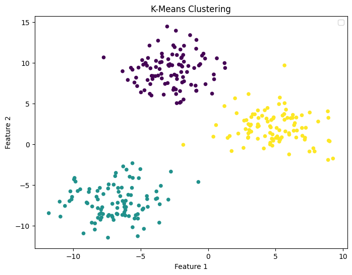
We can plot our dataset distribution by assigning to each data point a colour corresponding to one of the three cluster IDs predicted by the K-Means algorithm.
This graph demonstrates that K-Means successfully located the centres of the three distributions characterizing our artificial dataset.

# plot the dataset with the cluster IDs
plt.figure(figsize=(8, 6))
plt.scatter(X[:, 0], X[:, 1], c=y_kmeans, s=20, cmap='viridis')

plt.title("K-Means Clustering")
plt.xlabel("Feature 1")
plt.ylabel("Feature 2")
plt.legend()
plt.show()
Note: for a simple 2D problem like this, we just need to visualize the data distribution to check if k-means clustering was successful. As we will see later, numerical techniques for 2D and higher dimensional datasets allow us to check the cluster quality and even make an initial guess about the number of clusters K-means should look for.
Clustering 2D Data 3/6
Visualise the Decision Boundarylink copied
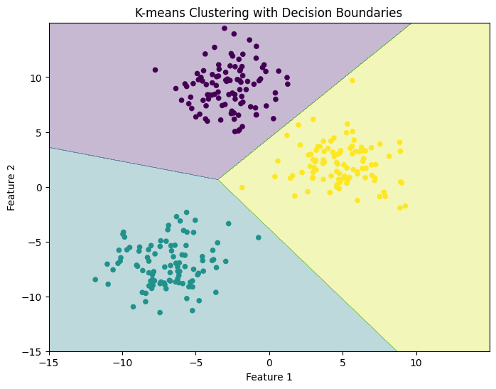
As with any other Machine Learning method, K-means can make predictions for points that are not part of the original dataset. The algorithm checks the Euclidean distance between any new data point and each cluster’s centre, and assigns a cluster ID based on point proximity.
Here we construct a point grid and use it as input data. The cluster IDs predicted by K-means are used to produce a visualisation of the Decision Boundary separating the feature space into distinct regions each containing points with the same cluster ID.
# generate input data points to plot the decision boundary
xx_range = np.arange(-15, 15, 0.02)
yy_range = np.arange(-15, 15, 0.02)
xx, yy = np.meshgrid(xx_range,yy_range)

# predict on each point
Z = kmeans.predict(np.c_[xx.ravel(), yy.ravel()])
Z = Z.reshape(xx.shape)

# plot the decision boundary and the data points
plt.figure(figsize=(8, 6))
plt.contourf(xx, yy, Z, cmap='viridis', alpha=0.3)
# plot the data points and color them by their cluster
plt.scatter(X[:, 0], X[:, 1], c=y_kmeans, cmap='viridis', s=20)

plt.xlabel("Feature 1")
plt.ylabel("Feature 2")
plt.title("K-means Clustering with Decision Boundaries")
plt.show()Clustering 2D Data 4/6
Hyperparameters Tuninglink copied
A key question when using clustering algorithms is: ‘was the initial guess about the number of clusters correct?’ In a 2D feature space, one can visually inspect the clusters and determine if clusters capture the shape of the data distribution. However, as we will see later, this is impossible in the general high-dimensional case.
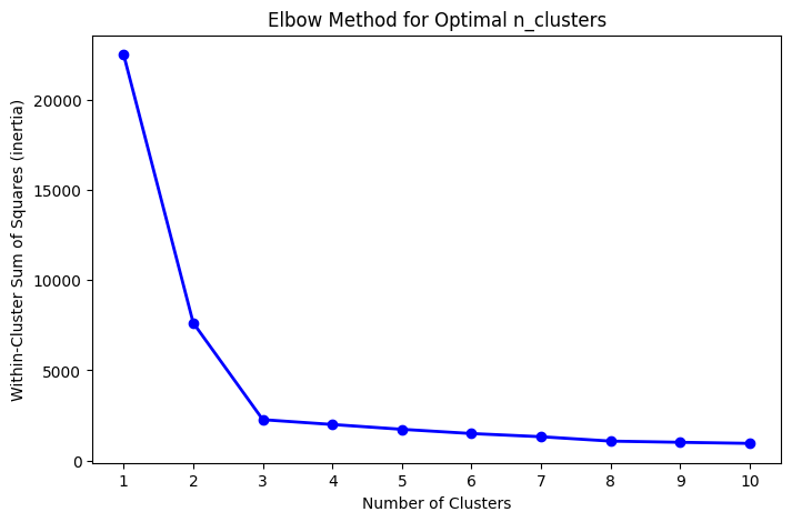
We will use a numerical technique called the Elbow Method to see for which number of clusters K-means reduces the Within-Cluster Sum of Squares, also called inertia.
Apply the Elbow Method
We will perform clustering on our dataset several times. Each time we run the fit method, we assign a different value for n_clusters and compute the inertia. We will then plot a curve comparing inertia values with cluster numbers and identify the elbow point, which is the point where the decrease in inertia starts to slow down. This point often indicates a good initial choice for n_clusters.
Here the elbow point occurs for n_cluster equal to 3. This is expected, as our dataset consists exactly of three groups of points (see Section ‘Generate Dataset’)
# Calculate the within-cluster sum of squares (inertia) for a range of k values
inertia = []
k_values = range(1, 11)

for k in k_values:
    kmeans = KMeans(n_clusters=k, random_state=42)
    kmeans.fit(X)
    inertia.append(kmeans.inertia_)
# Plot the Elbow Method graph
plt.figure(figsize=(8, 5))
plt.plot(k_values, inertia, 'bo-', linewidth=2)
plt.xlabel('Number of Clusters')
plt.ylabel('Within-Cluster Sum of Squares (inertia)')
plt.title('Elbow Method for Optimal n_clusters')
plt.xticks(k_values)
plt.show()Clustering 2D Data 5/6
Cluster Evaluationlink copied
To further validate the clustering process, we may want to numerically assess the quality of our clusters.
We will use a metric called Silhouette Score. This metric measures cluster quality by checking how similar each point is to points within its cluster compared to other clusters. The score ranges from -1 to 1, with 1 indicating perfectly separated clusters.
In this case, we have a silhouette score of approximately 0.7, which is larger than 0.5 and thus indicates well-formed clusters.
# Calculate the silhouette score
silhouette_avg = silhouette_score(X, y_kmeans)
print(silhouette_avg)
Output = 0.6996309397540692
To understand the effects of hyperparameter choices on the cluster quality and performance indicators, run K-means on a different dataset. Try generating different point distributions by changing the parameters of make_blobs or changing the n_clusters variable.
Clustering 2D Data 6/6
Conclusionlink copied
In this tutorial, you learned about clustering with the K-means algorithm. You learned how to apply K-means to cluster an artificially generated dataset and visualise clusters and decision boundaries in 2D. Additionally, you applied methods to evaluate cluster quality, like the Elbow Method and Silhouette Score, which help identify the optimal number of clusters.
Exercise file
Here you can find the full Python code which you can open in Google Colab or respective program.
Write your feedback.
Write your feedback on "Clustering 2D Data"".
If you're providing a specific feedback to a part of the chapter, mention which part (text, image, or video) that you have specific feedback for."Thank your for your feedback.
Your feedback has been submitted successfully and is now awaiting review. We appreciate your input and will ensure it aligns with our guidelines before it’s published.
